A friend had the idea to create a logo/illustration for the
seaside town where we live which could be used on t-shirts and postcards as we get a fair few holiday makers passing through, especially in the summer. Apart from the beach there's not really much here...
Spider diagram and thumbnails
Favourite thumbnails in different shapes
Pen drawing
It was difficult to decide between the oval and the circle,
but I thought the elongation exaggerated the height of the tower so chose the
oval.
Live traced and scanned the cleaned up version in illustrator
Made a rough coloured version in photoshop
Got some feedback, changed the umbrella to a grass one and
added a surfboard
Coloured
it in photoshop
This is a good start but the colours look a bit flat to me
so I’d like to add some texture. Here's the textured version (granulated filter), the colours are less bright because of the texture but it's more interesting.
Having listened to feedback I think that this version is less likely
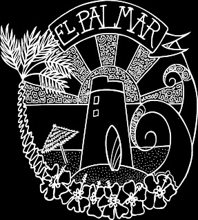
to appeal to men or boys because it’s a bit ‘pretty’ so I inverted the black and
white version with a view to screen printing it on a black t-shirt.
I experimented a bit and settled on a blue background for the postcards as it makes the colours more 'zingy'. I ordered some samples today.
I added some doodly patterns for interest and contrast
Having printed it out I was then drawn back to the circular
version
I like this but having spent so long cleaning and smoothing
the design I now wish is was a bit more rustic and hand drawn, but this is a
good start.
I then made a minor adjustment to the wave shape on the right side to make the emergence smoother.
I then made a minor adjustment to the wave shape on the right side to make the emergence smoother.


No comments:
Post a Comment