He speaks Spanish, Hebrew and a little English. I love the illustrations in this Hebrew book because they’re clear, colourful and vary in style, some of them being quite surreal
The
map in this one is excellent, as is the characterisation of the animals
As well as these animal based ads by Herve Moran:
https://encrypted-tbn0.gstatic.com/images?q=tbn:ANd9GcT74TWTjgpaEJaLkrnY2QfTpIjHGAg7pOpphpe0-S9JUj5c2Qyp
There are some lovely animal illustrations on this site:
WWF site, good source of species info http://wwf.panda.org/about_our_earth/species/
I used their list of priority species to help me choose
which animals to include
I also looked at other OCA Illustration students’ work for
this project:
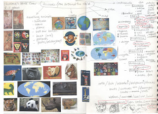
And then I made a spider diagram and some thumbnails and
sketches, representing each animal with just its head
And did some further research finding these beautiful,
charming and incredibly skilfully drawn animal illustrations by Alexandra Ball http://www.illustrationweb.com/artists/AlexandraBall/view
which are really inspiring
I decided to make a map of the world by collaging in
photoshop, combining this lovely paper as the sea
and this photo I took of a rusty piece of farm equipment as the land
mass,
using a map I found on the internet as a template. I made
two versions to cover both book shapes I had in mind...maybe the background
colour is too dark for a children’s book?
These are two versions of the first colour line visual, I made
digital sketches of the animals with my tablet using my thumbnails sketches as
a guide. I think the colours may be too muted for a child audience but the colourful
text makes it more eye catching.
So then I played with the map to make the colours a bit
brighter and decided to simplify the animal aspect by just including one, I
chose the panda because he’s instantly recognisable, striking and ‘monochrome’,
and played on the ‘around the world’ part of the title by sketching the panda
snuggled up to the globe. Maybe this is too young for the audience age group?
The size of these square covers would be 25cm.
For my third line visual I decided to develop the hot air
balloon idea using the wider format version of the lighter map and my tablet
sketches from the first LV. Ideally it would have a couple more balloons and animals
and the size would be 24x17cm.
I chose simple fonts in lower case for all the LVs to make
them more legible.
On reflection: After
an enthusiastic start I found this exercise pretty hard going and had a longish
break after doing the thumbnails because I felt stuck. I could blame the upheaval
of the festive period but I think this was also because my technical skills lag
behind my ideas generation and I balk at having to develop my ideas beyond the
thumbnail stage and because there are so many incredibly impressive illustrators
for children that I don’t feel I have anything to add in this area. I made a
big push today and finished it, which is a relief.
My favourite is the panda design, as it’s the simplest but as I
said above I think it might be too young for the target age group.
This was the first time I'd drawn with a tablet and I'm pleased with the result, it's quick, simple and has scope for more complex drawings.
This was the first time I'd drawn with a tablet and I'm pleased with the result, it's quick, simple and has scope for more complex drawings.
This is my drawing, in charcoal and chalk
and my three line visuals which I worked on in photoshop


No comments:
Post a Comment