Brief
·
Context
To design a sign for a house called La Casa
del Sol, which can also be used for business cards.
·
Content
A representation of the sun, sky and sea with
text ‘La Casa del Sol’
·
Role
of Image
To sign post the house entrance and to act as
a logo for business cards
·
Audience
People seeking alternative therapies
·
Stylistic
aspects
A mandala, colours: yellow, orange, red, turquoise
·
Effects
Brightness, positivity
·
Tools
and Materials
Sign: marine ply, gloss paint, varnish (for
maximum weather resistance)
·
Size
Business cards: 84x55mm (to be ordered from
moo.com)
Sign: 64.7cm square
I
started my research by looking at mandala and sun images on the internet and in
books.
Mandalas
Hearts and flowers https://encrypted-tbn1.google.com/images?q=tbn:ANd9GcRQvuwIkwlc3QaWFzYj3OyRCvT8_7mdLbFbkMlYl76kcuFTaXeS
Tibet http://upload.wikimedia.org/wikipedia/commons/thumb/1/14/Mandala_gross.jpg/220px-Mandala_gross.jpg
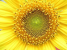
Sun pattern https://encrypted-tbn0.google.com/images?q=tbn:ANd9GcRNIlgB_XWtle_rgRcKtkTBqwqCuwZpQ4m8o7oRo5MWCWTLvzG3Pw
Fibonacci
sequence https://encrypted-tbn0.google.com/images?q=tbn:ANd9GcRaBVFUiP1OGo_T9UYElaOIcv6Kval3HOTyzRHWkPn9PggWCfXHsQ
Cartoon
sun https://encrypted-tbn1.google.com/images?q=tbn:ANd9GcRDl9lI8-5nzeY8oofA1GKi2eNGdQbnJI4Q_vkgNdylb25WPNcJTw
Smiling
sun https://encrypted-tbn2.google.com/images?q=tbn:ANd9GcSxy5WPZEVpQx7qTUuLNiTdXB5xj05dm3Fzp2AeDFa0oemt75DmQA
Sun over sea https://encrypted-tbn3.google.com/images?q=tbn:ANd9GcTYu2p-LRiznNBDvn2hgQpSLweEhLnTW4SJ8vZwbQIih1jSRdTQSw
Then
I made spider diagrams for ‘sun’, the client’s personality and her type of
therapy and a mood board with my favourite images found images. I also wanted
to use elements of the golden proportion and the Fibonacci sequence so I made
notes on these and drew some thumbnails.

One
of the sketches stood out as being particularly harmonious for me so I developed
it into a line visual which I showed the client, and she approved, along with
the quote and the basic colours. She also decided on the size and shape of the
sign at this point.
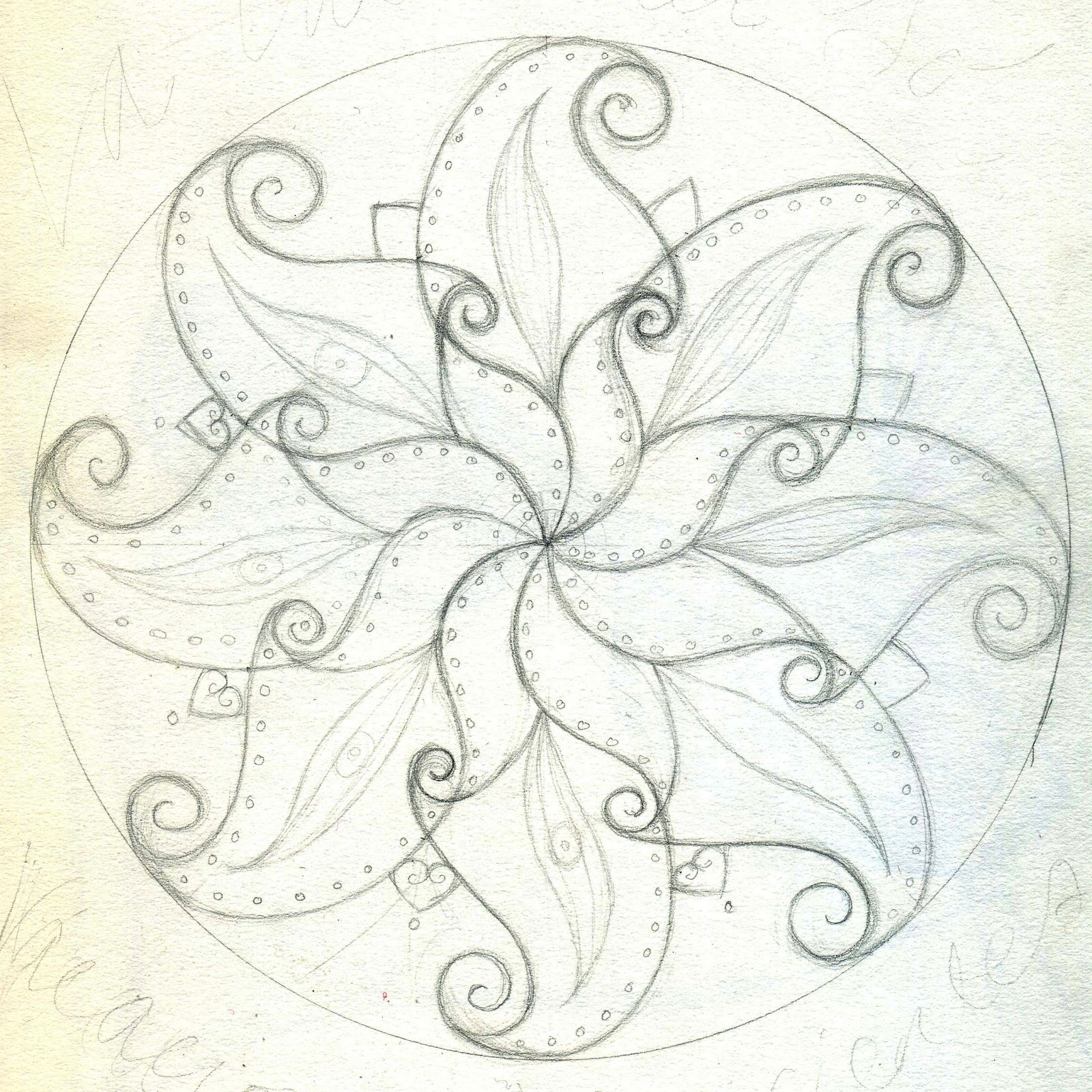
I
made enlarged photocopies of the line visual which I transferred onto the primed
wood using tracing paper.

I
started painting the sign and the client came to see some colour swatches and
indicated which of the mixed shades she wanted me to use.


These
show the various stages:


Unfortunately
the masking tape that I used to help mark the frame margin pulled some of the
background paint off so I had to carefully colour match and repair the damaged
parts.
Finally
I added clouds, waves, the house name (choosing the client’s favourite colour)
and added touches of gold to the mandala and the frame.

I
designed a business card using a photo of the partially painted sign so that
the design wasn’t overly detailed at a smaller scale. I had given the client
the option to have the logo designed separately but the former was a way to
make the process quicker, thereby cutting costs.
The
business card design

I
then showed her how to set up an account with moo.com and helped her order her
cards.
Reflection:
In
the end she was very pleased with the sign and so was I but there were some
problems:
·
I
sent her some business card samples and a photo of the sign which in retrospect
didn’t represent the colours well and there were a stressful few days for both
of us before she saw it ‘in person’ and approved.
·
The
painting took me many more hours to complete than I had anticipated.
Next
time I would adjust the quote accordingly and not send a photo unless I'd made absolutely sure that the colours were true.
No comments:
Post a Comment