Thursday, June 28, 2012

Other Local Artists: Tarifa


About a month ago I went to a collective art exhibition in Tarifa and was really impressed by the range and quality of work there:

Sculpture:


Beautifully fine stone work by Benji Lowsley Williams


Intricate wood work by Juan Sanders, http://www.bigsanders.com/
who’d spent 12 years constructing this man from scraps of wood, some of which he’d removed completely to make the structure lighter and some by sanding away at the surface. The wooden man was suspended on an elastic support allowing him to move freely when touched and I was told by the artist that he had previously been attached to a clockwork mechanism. I was particularly impressed by the contrast between the smoothly sanded and contoured front and the rough patchwork quality of the back which allowed you to see the ‘innards’.


The bolts were wrought iron and incredibly heavy (I can’t recall the artist’s name), I like that combination of weight and elegance very much. Although they’re abstract in design they have a figurative quality.


Painting

This was a fragment of the painting by Juan Sanders which accompanied his wooden man, representing the clockwork mechanism which had previously allowed him to move. It is almost sculptural in its surface relief.


I love the ethereal quality of this painting by Sophie Roche, despite the red fleshy cheeks and lips the face has a skull-like quality because of the dark eye sockets and the bone coloured nose, which is emphasised by the bone colour of the flowers.


Sophie also painted these old bent wood laminate and metal school chairs with enchantingly delicate sea- and land-scapes. I love the way she’s divided the ‘canvas’ into areas and juxtaposed blocks of colour with different scenes to give them a patchwork quality and also how she’s added texture to the painted surface with her brush strokes and by rubbing and chipping the paint off afterwards.
Although these photos don’t do them justice, these were my favourite pieces in the whole show, I think because of the element of surprise at seeing such ordinary, old, familiar objects adorned in such a light and careful way.

 Don Porteous painted a series of flowers using thick layers of glossy acrylic to build up texture and colour. This is my favourite of the series; I love the pink/green complimentary colour combination and the free and relaxed lines (which could be finger or brush marks) in the petals and the drips and splashes over the top.


Pere Carrizo used an air brush to create a series of paintings each with abstract/architectural themes, apart from this one which represented his wife and unborn child. There was a quiet calmness to these that I found quite relaxing


But on the whole I found this other piece of his much more pleasing visually, because the colours and forms are stronger and I like the perspective which is emphasised by the work being split into sections. The towers have the look of some sort of 50’s or 60’s space experiment which is reinforced by the palette and the way the artist has chipped the surface.


Video/Photo/Installation


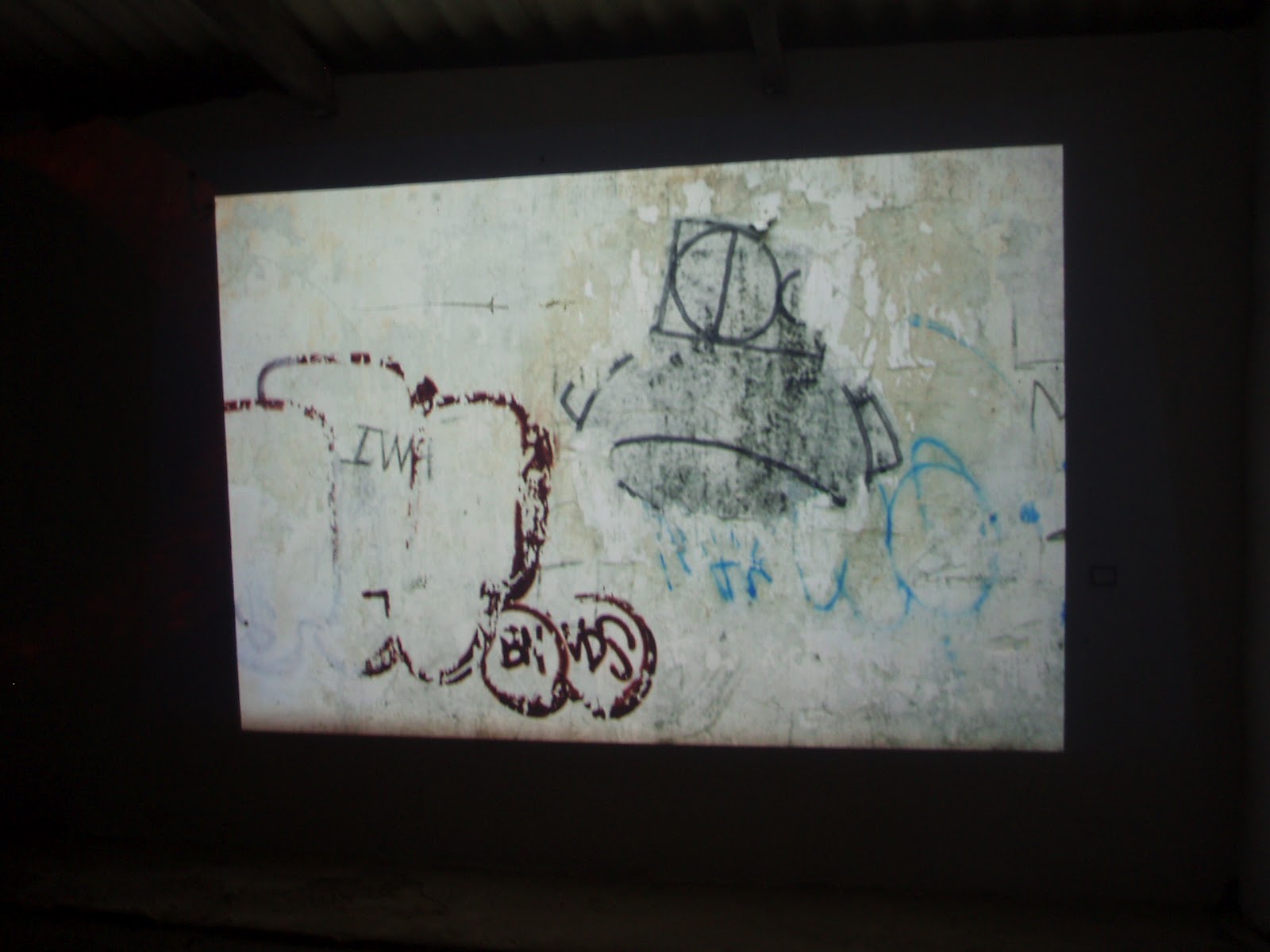
Karen Emslie set up a slide show of photographs of the area, my favourites were of local graffiti as the textures were interesting and also the colours seemed to fit well with the surroundings as they were projected inside a big, rough work shop.

Also in this part there were an installation of an eclipse using light projection and a rotating circle which was evocative 


and a short film of a man apparently in anguish which was shown out of sync on 6 televisions held in a stand. (I didn't get these artists' names)


 The dark, bleakness of the room, the discordant soundtrack and the disjointedness of the repeating images of the man pulling faces and moving his hands over his face and through his hair made the watching experience both fascinating and disturbing. It took a while to register that all the televisions were showing the same film, and because of the close cut the hands could have belonged to someone else. Interesting.
 

Other Artists


I've been following Rob’s blog www.bertslearningblog.blogspot.com since it was OCA blog of the week and am really impressed by the quality of his drawings and course work (great clean lines and professional looking finish). It’s helped inspire me with my course work and Rob also posts some interesting and useful links to other artists, such as

Christopher King
An English illustrator and graphic designer who, alongside finished artwork, posts his working process really clearly, such as the making of this Clint Eastwood portrait http://www.wingsart.net/home/2012/06/28/clint-eastwood-portrait/ which he used in a film poster for a Ritzy Cinema competition.
His blog also includes great book reviews and links to other artists such as

Rich Reitveld
A Californian artist whose humorous and exquisitely rendered surf graphics have won him great acclaim (and cash). I love the colour, elegance and detail in these.

And

Dave Stevens
Who (as well as creating The Rocketeer) was a master pin-up painter until his death in 2008. I particularly like the way he portrays women as muscular, powerful physical presences, like this Betty Page portrait http://www.davestevens.com/html/sketch_012.html

Jillian Tamaki
I chose one of her illustrations for my ‘line visual’ exercise and investigating further found that she has a huge range of styles from the graphic quality of this http://www.jilliantamaki.com/political-sex-scandals/, which I love for its strength, clearness and humour, to the more ethereal http://www.jilliantamaki.com/croquet-ball/ (winner of the 2012 Society of Illustrators gold medal) which, although I like the balance and clarity of the foliage, flowers and penguin, I think is spoilt by the central figure which I find  stiff, inelegant and poorly coloured. I’d also question the composition which cuts off the head of the monkey; these watercolours of babysitters http://www.jilliantamaki.com/babysitters/ are brilliant observed and executed and she has also worked with embroidery http://www.jilliantamaki.com/embroidery/penguin-thread, of the three the award winning Black Beauty is my least favourite, again it looks stiff to me, but for all my criticism I take my hat off to this talented, successful, prolific illustrator who has some useful advice on putting a portfolio together on her sketchblog http://blog.jilliantamaki.com/page/2/.

Saturday, June 23, 2012

Project: La Casa del Sol

Brief
·         Context
To design a sign for a house called La Casa del Sol, which can also be used for business cards.
·         Content
A representation of the sun, sky and sea with text ‘La Casa del Sol’
·         Role of Image
To sign post the house entrance and to act as a logo for business cards
·         Audience
People seeking alternative therapies
·         Stylistic aspects
A mandala, colours: yellow, orange, red, turquoise
·         Effects
Brightness, positivity
·         Tools and Materials
Sign: marine ply, gloss paint, varnish (for maximum weather resistance)
·         Size
Business cards: 84x55mm (to be ordered from moo.com)
Sign: 64.7cm square

I started my research by looking at mandala and sun images on the internet and in books.

Mandalas

Then I made spider diagrams for ‘sun’, the client’s personality and her type of therapy and a mood board with my favourite images found images. I also wanted to use elements of the golden proportion and the Fibonacci sequence so I made notes on these and drew some thumbnails.


One of the sketches stood out as being particularly harmonious for me so I developed it into a line visual which I showed the client, and she approved, along with the quote and the basic colours. She also decided on the size and shape of the sign at this point.


I made enlarged photocopies of the line visual which I transferred onto the primed wood using tracing paper.


I started painting the sign and the client came to see some colour swatches and indicated which of the mixed shades she wanted me to use.


These show the various stages:


Unfortunately the masking tape that I used to help mark the frame margin pulled some of the background paint off so I had to carefully colour match and repair the damaged parts.

Finally I added clouds, waves, the house name (choosing the client’s favourite colour) and added touches of gold to the mandala and the frame.


I designed a business card using a photo of the partially painted sign so that the design wasn’t overly detailed at a smaller scale. I had given the client the option to have the logo designed separately but the former was a way to make the process quicker, thereby cutting costs.

The business card design


I then showed her how to set up an account with moo.com and helped her order her cards.

Reflection:

In the end she was very pleased with the sign and so was I but there were some problems:
·         I sent her some business card samples and a photo of the sign which in retrospect didn’t represent the colours well and there were a stressful few days for both of us before she saw it ‘in person’ and approved.
·         The painting took me many more hours to complete than I had anticipated.

Next time I would adjust the quote accordingly and not send a photo unless I'd made absolutely sure that the colours were true.


Friday, June 22, 2012

Exercise: Client visuals

Image 1

No Trespassing by Jillian Tamaki


Line visual 1


Line visual 2


In retrospect I think my both these visuals are honest to their source. The arch is less convex in the original but apart from that they’re fine.

Image 2

La mantilla y la peineta by Eleazar


Line visuals 1 and 2


Likewise, I think these visuals are true to the source illustration too.
Obviously the more detailed version in both cases gives more of an idea of the finished piece.

I imagine the art direction for this illustration by Keeler and Tornero would include notes that:
·         It’s a collage of three elements
·         The background is an old black and white photograph of a church steeple
·         The modern ‘brutalist’ building in the foreground is also a black and white image but probably a colour photograph
·         The bird emerging from the building is painted in watercolour in the style of a Victorian ornithological guide.


This image by Miluka Sanz illustrated an article on the importance of intuition in a Sunday supplement.


The main points for art direction are that:
·         It’s a collage
·         The images of the figures are in the style of black and white newspaper photographs
·         They are on a bright pink paper background with a torn edge
·         The ear on the left figure is collaged from a colour magazine with printed text leading in to it representing the subliminal absorption of aural information
·         There is a collaged colour photo of a lamp over the figure on the right, casting a light beam down over him, representing sudden illumination
·         There is a diagrammatic style black and white drawing of an ear obscuring part of his upper body with a light green ‘Chine collĂ©’ style stripe over it
·         The compass obscuring part of his lower body is another colour photo, it represents the ‘inner compass’


Saturday, June 2, 2012

Exercise: Viewpoint


I chose the word summertime and these are the best of the photos: 


I drew some thumbnails in square format using a stiff paper view finder, which made it much easier.


My favourite is the one to the far left of the second row down because the composition is simple (because it is a close up), this also gives it a feeling of  intimacy, as does the sense that you are looking into someone’s beach bag, or even into their face because of the sunglasses. The shape of the zip softens the edges of the frame and works well with the outline of the sun lotion bottle.  It has the essence of summer because of the immediately recognisable forms of the sun glasses, sun lotion and sea shells. 

This is my line visual, which I drew from the still life:


Living close to the ocean, the summertime for me means having a beach bag ‘on standby’- settling down to sunbathe with a book for an hour or so is a special treat and a self contained and private experience, which again sits well with the intimate composition.

My overall composition was much larger, and really only worked as a whole when seen from in front and above. I think the individual elements were lost when I changed viewpoint so I tended to be drawn to details, particularly to this section which worked best when seen from above, at a slight angle.

Because I chose an ‘intimate’ section of the composition, the square format worked better than the rectangular view finder of the camera as it is compact, thereby giving a sense of containment of the forms within the frame and complimenting their relationship to each other.

I’m not sure that the texture of the towel works and if I were to develop this into a final artwork I might choose a different texture for the foreground items to rest on, such as a blanket. Also, if I were to repeat the exercise I might change the composition to include more of the book title ‘The Shell Collector’ which would further unite the individual elements.