Thursday, May 24, 2012

Other Artists


Via Axis contemporary art website, following OCA video of Sheila MacGregor:I love this sculptural textile piece by Marilyn Rathbone ‘100 metres dash’. She hand braided the silk which looks like a shoe lace and has dashes all along its 100 metre length. The reel and label make me feel nostalgic for haberdashery stores (although the length would have been in yards). I can almost feel the patience of the task wound onto that reel but despite the measurements given I can’t really get my head around the scale. http://www.axisweb.org/seCVPG.aspx?ARTISTID=12675


William Heath Robinson 1872-1944
To be honest I had no idea that the term ‘Heath Robinson’ in respect to inefficient or ludicrous contraptions was actually the name of an illustrator (or four illustrators if you count Will’s father, a wood engraver, and his two older brothers) who drew such machines.

I’ve found his biography (by James Hamilton, Pavilion Books), in the house I’m staying in, and am impressed and enchanted more by his drawing skills and the range of his style than by his humour. Interesting to read how he was put off his original dream of being a landscape painter by a dismissive art dealer and how his utter determination to be a successful illustrator paid off in the end.

Also interesting to see how his early pen and ink illustrations were influenced by woodcut techniques
eg The Arabian Nights Entertainments 1899 


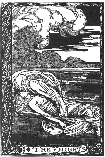
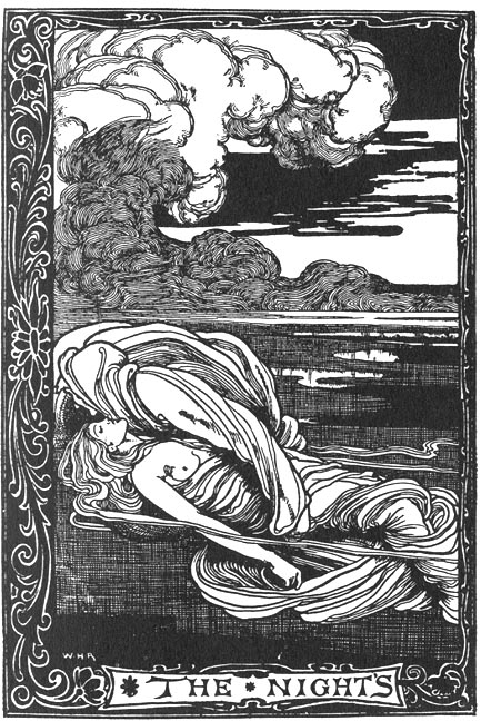
And how they then were influenced by Aubrey Beardsley

eg The Night’s Plutonian shore 1900 Poe Poems

His use of watercolour with pen and without is exquisite

eg In ‘Follow after- we are waiting by the trails that we lost’ from A Song of the English from 1909


he uses a similarly muted palette to ‘Blasting Limpets on the Barbary Coast’ 1906

but the tone is totally different. The former being sad and ethereal and the latter comical.

I love the detail and the muted palette in ‘Farmyard and Barns’ painted in the1920’s.
Shown at 4:11 of this lovely little film about him at http://wn.com/William_Heath


Project: CD Cover


I was asked by a friend to design a CD cover for one of the bands he plays with.

Brief
·         Context
To illustrate the cover for the new CD by local blues band Mr Groovy and the Blue Heads (title as yet undecided)
·         Content
New Orleans feel but in Andalucia, voodoo, skulls, blues band, street party, Mardi Gras, pin up style femme fatale (long, dark hair, possibly tattooed). Undecided as to whether text will be included in or around the image
·         Role of Image
To represent the band and their music in an anti-crisis, good time way
A black and white version (cheaper to print) may also be used for t-shirts
·         Audience
Blues fans of any age
·         Stylistic aspects
Bright colours, masculine, pin up
Hand written text with ‘Arabic curls’
·         Effects
Image to be hand painted and the band’s name and CD title hand written around the image
·         Tools and Materials
Pen and guache original to be scanned and made into a printable format
·         Size
To fit CD case 13.8x12.5cm


Generating Ideas
As first the brief was less specific so I consulted with a band member over my choice of mood board images and initial sketch 


which needed to be less Mexican and more voodoo/ Andalucian

I made a spider diagram and mood boards


and made a line visual to scale while listening to the band’s first album.
I have drawn Cadiz in the background and represented the band by voodoo style skull sticks, drawing them at different angles to the frame to give them more energy.


I experimented with different crops (see second mood board above) and roughly coloured one version with pencil.


The band approved the image, preferring the full version and the lighter sky and at this stage they decided to include the band name and title around the image. They gave me an unmixed version of the recording to listen to while I was working.

I wasn’t entirely happy with the composition of the band/skulls because the drummer ‘jarred’ with the buildings and there was a boring area of building behind the bassist’s head.. I tried different variations via collage and photoshop before tracing the elements of the initial drawing to a heavy weight flat paper.

I outlined it in Indian ink but had a smudging accident at the end so redrew it in pen.


The pen lacks the intensity of the ink but it’s safer. I used the smudged outline as a colour trial, but I mistakenly washed the palette before starting on the new version, losing the flesh tone which I wasn’t able to reproduce.

I will add black in blocks digitally to the black and white outline so that it can be printed more easily.

I chose to use gouache as the colours are clear and bright but more intense than watercolour.

The hierarchy of the image in colours:
·         Black blocks for the woman’s hair, the singer’s hat and the band’s eyes and mouths.
·         Hot red used for the flower, lips and breasts.
·         Hot red used for the singer’s hat band, scarf and the guitarist’s feather
·         Hot yellow used for the woman’s harmonica earring, also used on the hat/drum, warm brownish/yellow tones on the guitars
·         Warm blue tones used for the skulls
·         Darker tones used for the palm which frames the woman
·         Lighter but still warm yellow tone used for cathedral roof. The eye is drawn here from the yellow harmonica and yellow drum skin.
·         Cooler lighter tones used for the sky, water and buildings making them recede


I used photoshop to make the colours more intense, to smooth out some of my rougher
brush marks and to improve the skin tone. 


I then set to work designing the text 


which I then scanned and manipulated in photoshop


before adding it to the image and sending it to the band again for approval....


They're really happy with it, but suggested that the background was a little flat and the skin
tone a little irregular so I worked with masks and layer multiplication in photoshop to give
the image more depth and to flatten the skin tone.  

I also changed the o’s slightly and added the title.


The finished cover has had a great reception from the band and their fans, relief...


Wednesday, May 9, 2012

Exercise: Abstract Illustration

Music
  • Freddy Freeloader by Miles Davis

Materials
·         Chalk
·         Charcoal
·         Guache applied with a feather
·         Gold paint applied with fingers
·         Red handmade paper
·         300g watercolour paper painted with black gloss


I tried to get the layered texture of the music down by listening to the track repeatedly and concentrating on a different instrument each time and using a different material.

I decided to photograph the pieces instead of scanning them, positioning them differently with relation to the sun and the shadow of leaves and using different camera settings to see what effects I would get.

These are the best pictures of the whole pieces:


rhythmic

skippy

Now, for some reason, although I’ve selected square sections that I like, 


and I’ve manipulated them in photoshop,


I feel enormous resistance to the task of reproducing them by hand. I think it’s because I already did it once and can’t see the point of repeating it, or perhaps it seems forced to rework something that came about quite spontaneously.


This is my chosen square, which I think would work quite well as a CD cover design for the music; I’m going to leave it for now and try to come back to it another day.


Saturday, May 5, 2012

Exercise: Image development


I made a short list of potential images and chose a shot of an interior from a magazine because I found the colours, shapes and textures so interesting and I did the cropping exercise using photoshop.


I made an effort to crop different sections of the entire image, for example

framed

but was always drawn back to the centre of the original image, which I guess you’d say was the subject, in which case I made it more important in pretty much all of my crops.

stripe

triangles
wedge


The images which I rotated so that the verticals and horizontals were at different angles to the frame were definitely more dramatic because of the sense of instability.


radius

All of these crops had an abstract feel, which I found really pleasing but felt that I might be missing out on the figurative element so I repeated the exercise using one of my photos with people in it.


I made one rotated image, out of curiosity, and that’s the most dramatic of the second batch because of the angles


leaning

For me, the close cropped images of the people are also dramatic because they are taken out of the context of the rest of the scene and are therefore more mysterious.

balance
waiting


hand


I’m not sure if the melon stall or the squatting man next to it is the main subject of the original image. The stall is in the centre and is deeply coloured, so tends to draw the eye.
These crops all make the stall more important

melons

hidden


88D&G

pensive

but these change the subject entirely


relax
stopped


I chose ‘stopped’ as the basis for my illustration.

I made a line drawing (which I forgot to scan) and had the idea to colour it with pencils in the style of the Schiele sketch I showed in my previous post. However, it became apparent that I’d got the proportions wrong and I wasn’t happy with the colour either so I decided to have another go and took a trace of my outline as a guide. Then I realised that my first drawing hadn’t been squared properly and that’s why I’d had problems with the layout. 


I then came across this beautiful calendar of paper cut images with one word captions by Nikki McClure http://nikkimcclure.com/portfolio/ and decided to rethink my approach to the drawing and the colour as these illustrations are so simple, elegant and clean and all the more effective for it.


Having traced my drawing and corrected the proportions I could see that it worked well as an outline only so I began looking for an interesting background to draw it on. I came across an old cardboard envelope and the customs label on it reminded me of a package that I’d sent to the UK a couple of weeks ago that hadn’t arrived because it was stopped in customs. I really liked the texture and colour of the cardboard and thought it would work well with Indian ink.

I decided to shade the drawing by stippling as the dots are effectively full stops and then added some splatter to take the full stop motif further and tie in with the aged nature of the surface. Then I circled the word customs and filled in the hat with red pastel to add a touch of colour, red being the colour that I most associate with stop.


I wanted to have the image stop before the borders of the page but my scanner bed wasn’t big enough to do it in one go so I decided to crop the sides and leave the top and bottom borders open.

I then made adjustments to the image and added text in photoshop.

I chose a very simple font as I wanted the word to look definite and added a full stop for emphasis.


I tried the text in white at an angle but it looked too dynamic and jarred with the angle of the white label so I tried it again in red and bold black in the lower right hand corner so that it’s the last thing on the page, like the end of a sentence.


 I like the red very much as it ties in well with the hat and circle but I think the bold black conveys the meaning of the word the best.


The image could also be seen as a comment on the immigration laws which limit the free movement of the people of North Africa who want to come to Europe. Many, many people die each year crossing the straits of Gibraltar in tiny boats, which you can see washed up on the local beaches. You could say that those people are stopped by the customs of Europe.


I found this exercise quite difficult, probably because I was trying to use a more complex composition than in previous exercises but overall I’m pleased with the outcome. The handlebars of the bike are slightly out but apart from that the drawing is OK and I’m happy with the materials I chose. I think the image and the text work well together. This has encouraged me to experiment further with different surfaces.


Sunday, April 22, 2012

Sketchbook: Schiele, Two Women


Having mentioned this painting in relation to some of  Dwayne Bell's sketches of faces in a previous blog I decided to have a go at it myself.


My rendition is in coloured pencil rather than gouache, I don't have a good range of gouache colours, but I'd like to get some and give it a try as it's heftier than watercolour but still light, quick and expressive. I've not done a bad job and I certainly enjoyed the process but it wasn't until I saw the drawing upside down that I realised my error in the left cheek bone and eye area of the naked woman. 


Schiele's treatment of the women in his life is highly questionable but there is no doubt about his genius as a draughtsman, I could feel the swiftness and confidence of his lines as I laboured over my copy. There's an energy and urgency and his angles are exquisite.


I particularly love the way he depicts hands and shod feet. His hands are big and angular and so three dimensional that you can imagine the fingers moving as you look at them. It's the' three dimensionality' that impresses me about his shoes too, that little glimpse of sole and the angle of the heel or the merest suggestion of an instep with one beautifully placed line. Lovely.


And then there's the apparently paradoxical fluid jerkiness of his drawing style and the complex crudeness of the colour - he must have had a very loose hand. Copying also made me really notice how many colours there were in the flesh, red and green as well as yellow and brown.


The story of this painting and Schiele's life make it all the more striking.