I was asked by a friend to design a CD cover for one of the bands he plays with.
Brief
·
Context
To illustrate the cover for the new CD by
local blues band Mr Groovy and the Blue Heads (title as yet undecided)
·
Content
New Orleans feel but in Andalucia, voodoo, skulls,
blues band, street party, Mardi Gras, pin up style femme fatale (long, dark
hair, possibly tattooed). Undecided as to whether text will be included in or
around the image
·
Role
of Image
To represent the band and their music in an
anti-crisis, good time way
A black and white version (cheaper to print) may
also be used for t-shirts
·
Audience
Blues fans of any age
·
Stylistic
aspects
Bright colours, masculine, pin up
Hand written text with ‘Arabic curls’
·
Effects
Image to be hand painted and the band’s name
and CD title hand written around the image
·
Tools
and Materials
Pen and guache original to be scanned and
made into a printable format
·
Size
To fit CD case 13.8x12.5cm
Generating
Ideas
As first the brief was less specific so I consulted with a band member over my choice of mood board images and initial sketch

which
needed to be less Mexican and more voodoo/ Andalucian
I
made a spider diagram and mood boards


and
made a line visual to scale while listening to the band’s first album.
I
have drawn Cadiz in the background and represented the band by voodoo style
skull sticks, drawing them at different angles to the frame to give them more
energy.

I
experimented with different crops (see second mood board above) and roughly
coloured one version with pencil.

The
band approved the image, preferring the full version and the lighter sky and at
this stage they decided to include the band name and title around the image. They
gave me an unmixed version of the recording to listen to while I was working.
I
wasn’t entirely happy with the composition of the band/skulls because the
drummer ‘jarred’ with the buildings and there was a boring area of building
behind the bassist’s head.. I tried different variations via collage and photoshop
before tracing the elements of the initial drawing to a heavy weight flat
paper.
I
outlined it in Indian ink but had a smudging accident at the end so redrew it
in pen.

The
pen lacks the intensity of the ink but it’s safer. I used the smudged outline
as a colour trial, but I mistakenly washed the palette before starting on the
new version, losing the flesh tone which I wasn’t able to reproduce.
I
will add black in blocks digitally to the black and white outline so that it
can be printed more easily.
I
chose to use gouache as the colours are clear and bright but more intense than
watercolour.
The
hierarchy of the image in colours:
·
Black
blocks for the woman’s hair, the singer’s hat and the band’s eyes and mouths.
·
Hot
red used for the flower, lips and breasts.
·
Hot
red used for the singer’s hat band, scarf and the guitarist’s feather
·
Hot
yellow used for the woman’s harmonica earring, also used on the hat/drum, warm
brownish/yellow tones on the guitars
·
Warm
blue tones used for the skulls
·
Darker
tones used for the palm which frames the woman
·
Lighter
but still warm yellow tone used for cathedral roof. The
eye is drawn here from the yellow harmonica and yellow drum skin.
·
Cooler
lighter tones used for the sky, water and buildings making them recede


I used photoshop to make the colours more intense, to smooth out some of my
rougher
brush marks and to improve the skin tone.
brush marks and to improve the skin tone.

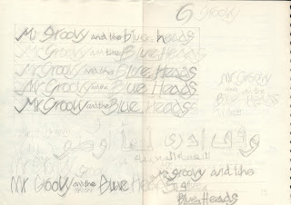
I
then set to work designing the text


which
I then scanned and manipulated in photoshop
before
adding it to the image and sending it to the band again for approval....

They're really happy with it, but suggested that the background was a little flat and the skin
tone a little irregular so I worked with masks and layer multiplication in photoshop to give
the image more depth and to flatten the skin tone.
I
also changed the o’s slightly and added the title.

The finished cover has had a great reception from the band and their fans, relief...
No comments:
Post a Comment