I chose to make my leaflet for girls as I have personal experience, although puberty can start as young as 8 years so I think the brief
is slightly inaccurate in stating that the leaflet should be aimed at young
teens.
Technical research:
Tanner stages
Stage 1:
Breasts - no development
Pubic Hair - no development
Growth - 2.0 to 2.4 inches
per year (all growth numbers are averages)
Other - ovaries growing
Stage 2:
Breasts - breast buds
Pubic Hair - starts with a
few lightly colored hairs
Growth - 2.8 to 3.2 inches
per year
Other - clitoris and uterus
growing
Stage 3:
Breasts - breast mounds
(tissue grows beyond areola without contour separation)
Pubic Hair - spreads, darkens,
and curls
Growth - about 3.2 inches
per year
Other - underarm hair begins
growing and acne
Stage 4:
Breasts - breasts feature
a projection of areola and papilla forms a secondary mound
Pubic Hair - adult-like (very
little change between 4 and 5)
Growth - 2.8 inches per
year
Other - first menstrual period
Stage 5:
Breasts - adult breast
contour (projection of papilla only)
Pubic Hair - adult pubic hair
Growth - complete / no
additional growth in height
Acne
Bra
Period
Hair
Emotions
Hormones
Ideas

 |
| Seaside amusement board |
 |
| Beach |
Visual research
Teenage fashion trends https://www.google.com/search?q=teenage+girl+fashion+trends+2013&rlz=1C1AVSA_enES462&espv=210&es_sm=93&source=lnms&tbm=isch&sa=X&ei=nrKAUoj_HaHX0QXxkID4Cw&ved=0CAkQ_AUoAQ&biw=1600&bih=785#imgdii=_
Teen mags for girls
Sketchbook
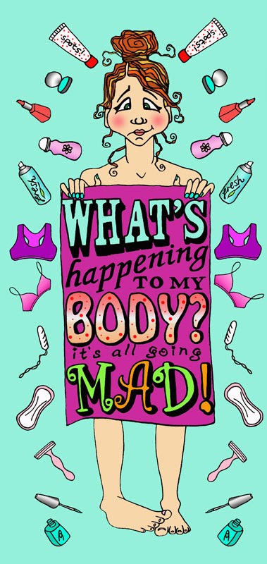
I wanted the character to express the confusion and
self-consciousness felt during puberty, as well as a bit of excitement


Hands and feet


I couldn't find the foot pose I wanted on the web so I asked someone to take a photo of mine

Thumbnails

Text layout iterations in photoshop for eventual tracing


Leaflet layout
Based on this one


Line visuals for cover


Traced and scanned into photoshop, line work cut out and
cleaned up

Colouring
I wanted the leaflet cover to be brightly coloured and
feminine but not too pale pink girly


I then experimented with textures on the towel and
background, and with making a pattern of the ‘icons’ in the background to
emphasize the many changes occurring

In the end I preferred the version with flat colours as
they appear brighter without texture and the image is easier to read
Experiments with background colour


Then I experimented with adding colour and texture to the motifs and text with the tiny splatter airbrush in Corel Painter 12 and to the background by manipulating the colour and saturation of this photo of cracked paving


I think the combination of colours in this version is very effective and reduces the influence of the 'pink cliche'.


I think the combination of colours in this version is very effective and reduces the influence of the 'pink cliche'.

Now I just need to copy the textured motifs onto the left side

I will use the same textured background for the inside pages of the leaflet for continuity


Brainstorming and thumbnails for the inside pages


I based the figure on this drawing I found on the internet

I used the free transform tool in photoshop to reduce the exaggerated height and then printed it out and used it as a template for my figure


I scanned the drawings into photoshop, cut out the line
work and applied the coloured background


I will use the same textured background for the inside pages of the leaflet for continuity

Some other educational leaflets


I based the figure on this drawing I found on the internet


I then experimented with inverting the line work and adding
blocks of darker colour to improve the contrast. I also removed stage 5 at this
point as it is pretty much identical to stage 4

Looking at them alongside the cover image I think the
dark line version on the lighter background is stylistically more fitting and
is also easier to read.
Here are the client visual for the interior pages with text and extra effects added in photoshop and Corel Painter 12

Learning points
- This was a complex project with many components
- I think my cover image works well and it's apparent that I enjoyed making this image more than the interior pages
- I tried to achieve continuity with the inside pages by using a similar figure, the same motifs and background and one of the same fonts as the cover
- The interior pages cover the basics with minimal text, although I don't think I managed to incorporate much metaphor or humour the hand drawn look gives it a sense of informality
- I chose to use stages rather than ages so as not to exclude those people who reach puberty outside the average age range
- I forgot the uterus!
Here is the updated leaflet with all the pages together
