BBC Travel Column 'Drawing on Experience' by Tim Baynes
These urban sketches by Luis Ruiz are wonderfully light and clear
Recycled book covers by Gary Taxali
Beautiful handmade travel guides
Zen of guide books
Recycled book covers by Gary Taxali
Beautiful handmade travel guides
Zen of guide books
Istanbul
Google search Helsinki
 |
| A display of travel guides in a book shop |
Brief
Context: Set of 3 travel guide book
covers
Content: Many elements (travel,
sites of interest, food, maps, city crests) drawn together
Role of Image: To represent
the cities of Milan, Istanbul and Helsinki
Audience: Travellers of all
persuasions
Stylistic aspect/ Effects:
diagrammatic; hand drawn type; vintage feel; artist’s travel journal; collage
Themes: location; travel; sites
of interest; fashion; food; folk art
Tools and Materials: Any
Size: 15x21 (spiral bound?)
Brainstorming


Mood board

Ideas for inclusion:
Milan:
fashion, ice cream, panettone, Duomo, Scala opera house, tram, train, plane,
mopeds
Istanbul:
Blue Mosque, Saint Sophie, carpets and tiles, Turkish delight, train, plane,
tram, boat
Helsinki:
Cathedral, zoo, amusement park, art museum, traditional pastry dish, fish, folk
art, tram, train, plane, boat
I
started with Milan, experimenting with different paper backgrounds and added
elements to my basic layout as they were completed. I intended to use the basic
layout for all the covers in order to unify the set.
Element:
title

Helsinki:
fonts considered:
Franklin Gothic Book (too plain); IMPACT
(too heavy); Palatino
Linotype selected for simple elegance and good weight and vertical dimension.

Istanbul:
fonts considered: Andalus (too similar to
Palatino Linotype); Symbol
OTT (too abstract) I researched Arabic simulation fonts online http://guindo.pntic.mec.es/jmag0042/arabic.html
then downloaded Afarat ibn Blady and made a collage Istanbul with the print out
which I then traced. Eventually
I modified the upward stroke of the b to make an upper case I.


Element:
maps
My
geography is useless so I thought it would be useful to have a locating map of
Europe with each country highlighted by its flag. This also acts to unify the set.

.jpg)


Scanned it
to photoshop, inverted it


I then
printed out flags and treated them with a crackle glaze and stain before scanning
them and adding them to my collage.

I
noticed that all the maps of a city have a certain pattern which I wanted to
capture.
There
would doubtless be a detailed city map inside the book so an outline on the
cover
would be fine.
I
looked online at various maps including this one
and
traced an outline of the main roads using this one as
a template, which I scanned into photoshop and experimented with different effects
and colours


before
deciding on this one, which unifies the set as I’ve used the same marbling
background as the other maps and the same old paper border that the stamps sit
on.

Element:
Places of interest
I
wanted to include sketches, such as those a visitor would make, of two of the
major sites in each city and to make them into stamps which would fit in with
the collage/artist-collector theme.
I
sketched these in pencil, then water proof sepia pen, then watercolour pencil
and a wash of water, then treated in photoshop.


Helsinki:
Cathedral
.jpg)


Istanbul (preparatory sketches): Blue Mosque

Hagia
Sofia

Postmark
Initially
I used a digital cut out of the postmark from this stamp over my sketch stamps
Then
I decided to include the name of each destination.
I
made mock-ups in photoshop which I then printed, traced and scanned into
photoshop before cutting out the line work.


Element:
travel
These
are the stages in the Milanese tram drawing: charcoal; acrylic wash;
manipulation in photoshop. I ‘scratched’ away the edges of the image to make it
look like a sticker which was wearing away.


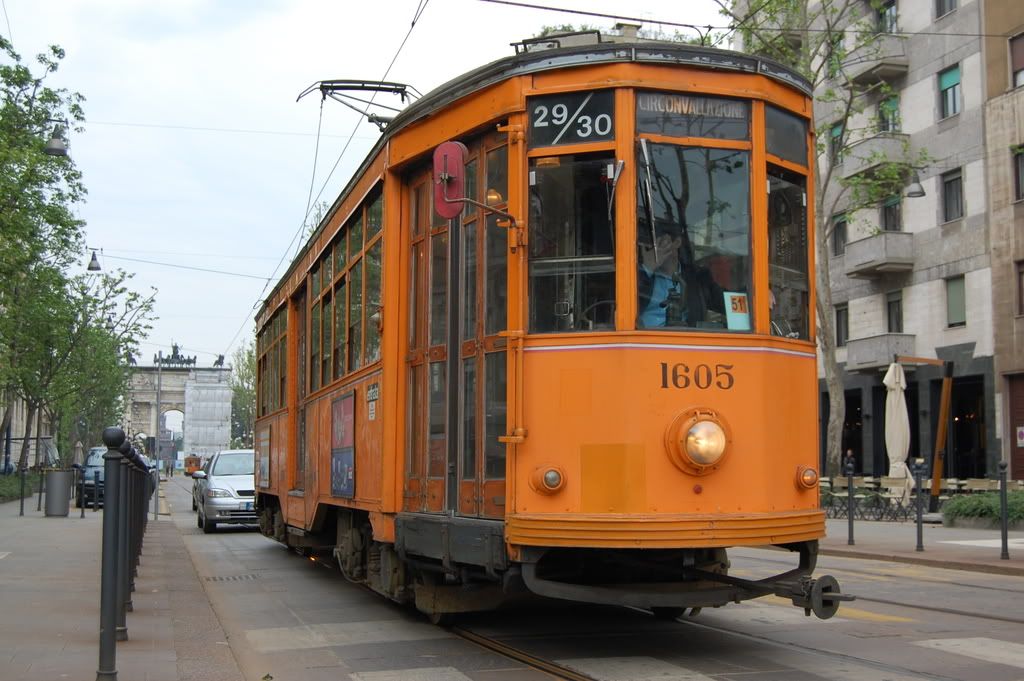
Helsinki
tram https://encrypted-tbn2.gstatic.com/images?q=tbn:ANd9GcSoAhbDQKwVoEBvUvSgv_AUWgmRsDedv6FkGjn2cInLAUBroqFU
Istanbul
tram sketch

Pencil
drawing, scanned, manipulated and coloured in photoshop


Boats
(not Milan)
Planes
(for all three, method as per train)


Scooter
(Milan, method as per train and plane)


Element:
city crest
Milan:
I used a combination of these http://upload.wikimedia.org/wikipedia/commons/thumb/9/93/CoA_Citt%C3%A0_di_Milano.svg/100px-CoA_Citt%C3%A0_di_Milano.svg.png
Istanbul:
I used a version of the football club crest which I couldn’t find again.
I
wanted to make icons from the food and miscellaneous elements, simple white
outlines on a circular coloured background with a white border like a sticker (inspired by the yay! stickers of moo.com).
In each case I made a drawing, scanned itto photoshop, multiplied its layers
and adjusted the brightness, contrast and levels until I had clean line work
which I could cut out and invert.
Element:
food
Milan:
Panettone http://www.gastaldiglobal.com/library/Panettone%20Milano.JP,
ice cream


Helsinki: Vendace


Istanbul:
Turkish delight
Element:
miscellaneous


Istanbul:
carpet/tile patterns

These
images show the development of my Milan cover


I also tried a more intense version to improve the contrast by multiplying the layers in photoshop

I added
some hand drawn elements in Corel Painter to make it less formal and link the maps.

This is the version that I will use for the mock up
Development of the Helsinki visual


Missing
elements: specific tram; boat; bicycle; drawn city map; amusement park stamp


Missing
elements: boat; specific
tram, drawn city map; finished stamps
Learning
points
My
initial urge was to travel to each country to collect mementos and sketch
onsite (totally impractical, obviously) so that’s what I tried to capture in my
illustrations.
Since
I work with many techniques and styles (pen and water colour; charcoal, acrylic
and crackle glaze; pop art style digital images) this seemed like a good
opportunity to bring them all together in a collage effect illustration.
I think it
works to some extent but I have been looking at the exercise for so long now
that I can’t be objective. The Milan cover is my favourite, probably because it
is finished, the other two don’t quite live up to my expectations at the moment
but time is ticking on so I will try to come back later to finish them.
The
little drawings were pretty quick and simple to do, but there are a lot of them which proved time consuming. I still prefer drawing with
a real pencil to drawing with my tablet.
I
made errors with the map of Turkey and the Finnish flag was difficult to read
initially; both corrected.
I
found these travel themed illustrations in an easyJet magazine when I had
completed the Milan cover
This mural painting animation is genius, I'd love to do one


There is a lovely digital collage here

The excellent Marc Aspinall at his Tree House Press

They have
similarities to my designs as they incorporate many elements, hand drawn maps
and digitally manipulated or generated drawings, some with a range of styles.
They all work well and I found this encouraging as my drawings are up to these published
standards.
No comments:
Post a Comment