Alain Uceda recently presented his vision of, and
experience as a ‘Domesticated Gallerist’ at the 15th edition of the PechaKucha in Seville


The format for the PechaKucha talks is that
invited speakers have 6 minutes in which to state their case on any subject
with an accompanying slide show; they have no control over the timing of the
slideshow once it has started.
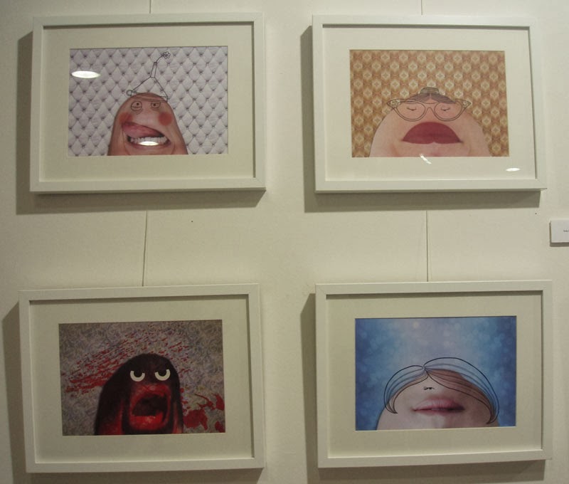
This is Alain’s slide show,
(which features a couple of the pieces I exhibited in the gallery during my
solo summer exhibition).
I have translated the accompanying text into English
(unfortunately some of the puns don’t translate):
1. The domesticated gallerist
The gallery at La Casa del Arco is defined as a ‘domesticated
gallery’ because it doesn’t bite; there’s no commission on sales and no demand for
a piece of art as payment (it’s also a private home). So how do we hope to make
a living?
To give some idea we’ll start by travelling back by 100
years to briefly journey through “the history of the art market in five steps”:
2. Welcome to the
fair
With the birth of the artistic vanguard the nature of the
relationship between artist and public changed. If until that point the public
(be they grand merchants or petty
bourgeoisie) were in control and artists made what they commissioned, from now
it is the artist who takes the initiative. As a consequence there will be
artists who achieve great success and others who pass without punishment or
glory. In other words those who make it, make it big.
3. Admit it: the dealer isn’t your friend
Once a demand is
established the market needs yet more buyers. The buyer and/or gallery owner in
combination with the critic start to complete their regulatory function.
Nothing bad, of course; the work of the intermediary was more than justified in
those times when the vanguard were revising the fundamentals of art and the
public had to liven up and take steps towards that cutting edge.
4. More wood. It’s art
Then came the war, in
which art and gold were hidden and pursued by the Nazis as sure investments.
From this moment the art market entered its second stage –the speculative;
works of art were bought for reasons other than the merely artistic, namely
financial.
5. Help yourself here
And then Warhol arrived
and established that absolutely everything was art and the world went mad. The
gallery owners didn’t have enough space for so much art, which sprung from all
directions, there was talk of art supermarkets, art for sale in Carrefour, in
Ikea, everywhere. The figures shoot up, art is a business so big that it
becomes difficult to avoid. The gallery owners see greedy multitudes come to
buy art, and if that’s what they’re after, that’s what they’ll get. You want
art? Help yourself!
6. When it goes pop, it just can’t stop
And the bother passed and
the New Age arrived. If everything is Art, why can’t everyone be an artist? The
theorem of Professor Pringles becomes reality and at the start of the 21st century
we can see that it’s no wonder that, in spite of the undeniable exceptional quality we grant to those who are artists, we’ve reached a stage when
there’s one (if not two or three) in each household.
7. One person, one artist
We all have an inner
artist waiting to get out (and triumph in the market) that must not be
suppressed. But what market can survive when supply and demand are tied at one?
And so we arrive at the end of this little story; this big bubble also appears
to have gone ‘pop’.
8. Opening a gallery to not make money: the ‘miserazgo’
In the middle of 2010 with
the crisis galloping and many galleries closing, opening a gallery in order to
earn money doesn’t seem like the best idea in the world. So we decided to open
a gallery in order to not make money, and in this we have achieved an
unquestionable success.
9. The web is an attitude
In parallel the other big
revolutionary factor in the world of contents, digitalisation and universal
access (downloads included), had provoked a withdrawal between the cultural and
artistic management, disposed to defend themselves tooth and nail, from the
pirates. But the internet, in opposition to what many think, is not a
technology or collection of hard-hitting devices, but a way of seeing the world;
the principle of authority has been replaced by one of cooperation,
transparency and trust.
10. P2P the intermediary stays outside
If wikitrust has superseded
such monumental icons as the Encyclopaedia Britannica and the Michelin Guide,
the other lethal step for the previous business model is that everything
appears to fall before the ghost of gratitude. Between one P and another P
there’s no room for the opaque-intermediary, only for the link-intermediary,
disposed to link the public with the artist and vice-versa.
11. This is not a gallery: a flesh and blood
blogallery
And how does a flesh and blood Blo-gallery
work? In a very similar way to any blog. First we concentrate on the art and
design theme. From there we propose and offer our own and external content, not
thinking about gaining clients, but [of gaining] relationships, followers,
people who share the same interests....content which appeals to us for personal
reasons, sometimes very personal. At the end of the day we feel at home.
12. Not thinking about sales. That sells
And, contrary to all
forecasts, in these two years of progress, each artist has sold more that his
or her predecessor. Every three months we invite one or two artists to exhibit
at their free will. They put forward the work, plan the exhibition, fix their
prices and conditions, and with our help, of course, the dissemination and
publicity, but without having to submit unconditionally.
13. What a good vibe!
All this is transferred to
the public, of course. The phrase that we hear most is ‘what a good vibe!’.
Because we recognise that we don’t enter with the same attitude a place where
we know they want us to buy something (wary, precautious, almost presold) as we
do a house where they open the doors to us without asking anything in exchange.
Because when they open the doors, they usually open their arms. And out of how
many shops, be they of art or not, do people come wearing a grateful smile?
14. The start of many good friendships
On the other hand, not
charging commission means that we select invited artists not according to how
well or not they will sell. It makes the artists themselves consider an exhibition
in La Casa del Arco an unprecedented opportunity; for the least experienced, who
would hardly dare to request an exhibition in the usual mercantile framework; but
it’s also a delicious experience for those more seasoned artists. These days
we get many more requests to exhibit than we ever could have hoped for from our
trajectory.
15. To live from art, not from the artist
But then...how do we make
a living? Our blogallery continues to grow through trust and recommendation,
and by no other means. And here is where the opportunities rise for new types
of business which are not aggressive towards the public or the artist. As our
community develops we learn to offer what is needed or wanted, not what interests
us or what people will buy from us. For the love of art? It’s usually said contemptuously
but what’s wrong with returning to the original spirit?
16. Spin off: artist in residence
With this renewal of
contents, what we get is that our own contents are seen more than they would be
if they were the only star. Two years after starting her work as artist in
residence the painter and designer Blanca Gortari maintains her work shop with
a growing rhythm of commissions and is starting collaborative projects with other
design and decoration companies. In the increasingly near future her space in
our incubator will be taken by another artist.
17. Spin off: specialist video production
A year ago we started up
our small production company specialising in art and design videos, together with
the producer Mariano Resquín. These videos are made photo by photo so that when you see
them you really see the art work. Now we get commissions from the artists who exhibit
and from the people who see them; another way to profit from trust without
the need to speculate on outside talent.
18. Spin off: communications consultant
Little by little we have realised
that the artist within this new context doesn’t have experience in using the
communication tools which they have to hand; now, when it’s more ‘mandatory’
than ever to be your own discoverer, art dealer, gallery director and even critic.
And not just the artist; the entire artistic management sector appears to receive kindly our specialist consultancy proposal.
19. Spin off: collective patronage
Our next project even in
its infancy is a step further along the same path: to put on collective exhibitions
of artist/patron peers. This and other innovations will continue to be developed
and revealed as they take shape. If you would like to follow them closely you
will find us in Vejer de la Frontera, at 1 Calle de Canalejas or on
facebook
20. The model of a
non-business is still a model
We believe that we have something to offer: a reflection
on the business model of the plaintive contents industry. Our scheme could be
seen as a small gallery in a village resistant to the rebel invader, or it
could be seen as a small step forward, obviously not the only one, but it is credible and real. Many thanks for your attention and for sharing this
presentation.
I find this philosophy extraordinarily brave and generous
and feel very grateful to have had the opportunity to exhibit in the ‘Domesticated
Gallery’


.jpg)


.jpg)


