

so I took a photo of a walking child and used one of my photos of a tree and redid it.

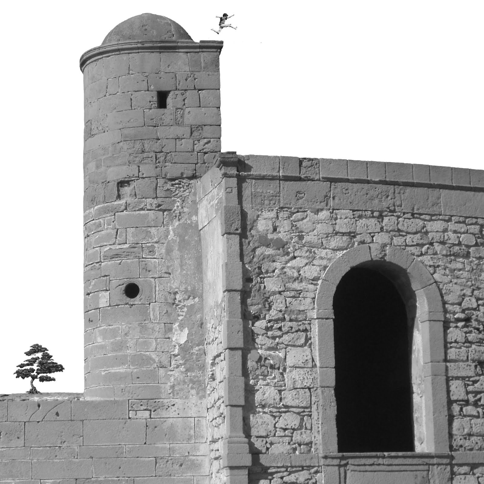
 When the figure is smaller than the other elements and all the elements are horizontal or vertical with respect to the frame there’s a sense of ‘normality’, of the image being solidly grounded

even when the figure’s in a potentially perilous position.
When the figure is larger than the building there’s a sense of distance even when all the elements lie on the same horizontal line, but actually, looking it at it again I can only see the castle as a toy

Then if I move the building up and add a horizon, it’s big again but far away.

If the elements are at different angles to each other there’s a sense of instability, of imminent movement and energy,

 which is exaggerated to the point of chaos if they’re all also at different angles to the frame (as well as being duplicated).
In retrospect I like the image of the running boy much better than my photograph of the walking child as he adds a real sense of dynamism to the overall scene and I think that the bonsai tree image I downloaded has a more pleasing form than my tree photograph. However, my favourite scene overall is the one in which the child has wandered under the tilting castle - the sense of potential movement and danger here is even more exciting than the boy jumping over the building, and it also makes me chuckle a bit, in a Monty Python way (maybe the child will pop out of the black doorway once the castle topples and scuttle away?). The horizontal line anchors the tree and gives a sense of distance, ‘underlining’ the precarious position in the foreground.

The hand on the child’s head was accidental and I thought of photoshopping it out, but it adds an extra creepy dimension which is interesting.
I forgot about this image (below-also made this morning), which is actually my favourite

It’s a simple composition but quite surreal because both the relative scales and angles of the elements are unexpected. And no child was put in danger to make this image.
I had a look at Kasia Lovick’s work after she was awarded blog of the week http://kasialovickillustration1.blogspot.co.uk/search?updated-max=2012-02-07T11:49:00-08:00&max-results=7&start=5&by-date=false and was inspired by her take on this exercise. Even in their crudest form, her scenes have a motion and elegance about them which I think mine lack. I found that her bright, curious, confident approach shone through in her other work too and hope to emulate her digital skills eventually.
No comments:
Post a Comment