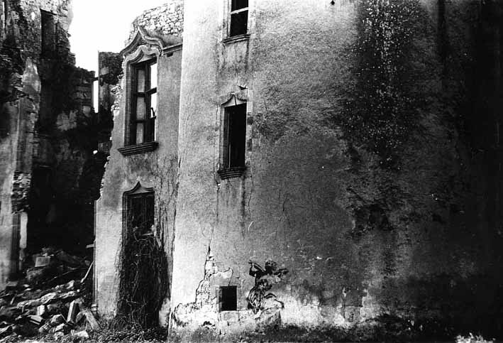
Having recently heard an interesting Radio 4 programme
(The UK’s First Street Artist? http://www.bbc.co.uk/programmes/b01mk8zs)
about Walter Kershaw who was previously unknown to me, I decided to take street
artists as my theme for this exercise.
Street artists are not strictly illustrators in the
classic sense but by using public spaces they communicate their ideas in a way
which is freely accessible to their audience, they have the wall in common as
their chosen ground and freedom of expression as their core motivation, whether
or not their message is overtly political.
Walter Kershaw (http://www.walterkershaw.co.uk/) started
his campaign to brighten up his hometown of Rochdale, Lancashire by painting
murals in the 1970s, choosing to decorate drab, derelict and condemned
buildings which were due for demolition as part of the slum clearance
programme.
The temporary nature of his paintings, destroyed by
either weather or demolition didn’t bother Walter (since he had a photographic
record of them); neither did the council’s frequent letters of complaint. He
wasn’t motivated by money, fame or making overtly political statements, his
‘mission [was] to place art amongst the people’, to be spontaneous, have fun and
‘add laughter to life’ in the neighbourhoods he decorated. The vast majority of
the residents think he succeeded.
Graham Cooper, one of Walter’s early collaborators says
that the murals were a method of ‘mass communication’ and that the gesture of
painting them was a political one despite their lack of political content.
This stands in stark contrast to the majority
of the almost 2000 documented murals painted in Northern Ireland since the
1970s which promote either republican or loyalist beliefs and eulogise various
paramilitary groups. For example this one depicting the Battle of Bogside http://en.wikipedia.org/wiki/File:Mural_-_Battle_of_the_bogside_2004_SMC.jpg
Walter says that he ‘enjoys the wit of modern street art’-
he singles out Banksy for praise, but sees himself as more ‘researchful and
traditional, [employing] accurate drawing and perspective’.
It seems that I’m not the only person inspired by the
radio programme since this Guardian article appeared the day after it was
broadcast:
Perhaps the most impressive of Walter’s murals for me is
the Trafford Park mural painted in 1982 http://www.walterkershaw.co.uk/trafford1982.htm,
for its huge scale, immaculate perspective, beautifully subtle colours and
detail, although it’s hard to choose between them. I also love the ‘Inside-out
House’ painted in Rochdale in 1975 (an image of this is featured in the
Guardian article) since, despite Walter’s statement, it is witty and I’m always
fascinated by the view of a partially demolished row of houses where you can
see the remains of the dividing walls and the wall paper of the rooms that once
stood there.
Walter and his painting partners used donated materials from
big paint companies in the 70’s, carrying cans on the back of a motorbike, no
handy spray cans for them.
At the start of the R4 programme Mark Hodkinson
ran through a list of other street artists; here are some of them:
Banksy
- started in the Bristol ‘aerosol boom’ of the late 1980’s
- stencils, spray paint
- witty, dark, political
- anti-war, anti-capitalism, anti-fascism, anti-imperialism, anti-authoritarianism, anarchism, nihilism and existentialism
- figurative cartoon
- installation, painting, film making
- ‘Exit Through the Gift Shop’: Thierry Guetta/Mr Brainwash (easy to believe that he is an invention of Banksy and Shepard Fairey; a clown through whom they can make vast sums of money without sullying their own ‘brands’); Space Invader (mosaics); Shepherd Fairey (see below); Seizer; Neckface; Ron English (painter); Dotmasters; Swoon (posters); Borf (commemorates the life of his best friend who commited suicide by using his name); Buffmonster
- Paintings (difficult to choose, but here goes)
o
A nasty urban scene featuring concrete, barbed
wire and a dumped mattress is transformed into a celebration of athleticism as a
metaphor for leaping over boundaries http://www.banksy.co.uk/outdoors/index.html
o
A succinct and deceptively simple addition to a
street sign that sums up the rat race http://www.banksy.co.uk/outdoors/nostopping2.html
o
Textual rather than figurative but laugh out
loud funny. The ‘unhand-drawn’ quality of the text makes the message seem more
‘official’ http://www.banksy.co.uk/outdoors/poplar1.html
19 Feb 2013
Breaking news: Banksy's 'Slave Labour' has been taken from a wall in Haringey and is due to be auctioned in Miami
http://www.independent.co.uk/arts-entertainment/art/news/anger-as-banksys-poundland-mural-ripped-from-wall-and-set-for-auction-in-miami-for-450000-8499802.html
also discussed on BBC R4´s Front Row http://www.bbc.co.uk/programmes/b01qmxg2 the following day.
Haringey council have urged the culture secretary to stop the auction and enable the return of the piece to Wood Green. The culture department have said that they won't intervene.Claire Kober, the council leader feels that the piece belongs to the people of Haringey while Godfrey Barker, the art market expert, states that the piece of wall on which it was painted belongs to the owners of the building and legally they can do what they like with it.
It seems unlikely that the auction won't go ahead but it wouldn't it be great if Banksy just painted another one in the same spot? If indeed it was him in the first place...
24 Feb 2013
The auction has been stopped and the ripped out Poundland wall has been redecorated http://www.itv.com/news/update/2013-02-23/new-artwork-replaces-banksy-mural/
I like the nun.
19 Feb 2013
Breaking news: Banksy's 'Slave Labour' has been taken from a wall in Haringey and is due to be auctioned in Miami
http://www.independent.co.uk/arts-entertainment/art/news/anger-as-banksys-poundland-mural-ripped-from-wall-and-set-for-auction-in-miami-for-450000-8499802.html
also discussed on BBC R4´s Front Row http://www.bbc.co.uk/programmes/b01qmxg2 the following day.
Haringey council have urged the culture secretary to stop the auction and enable the return of the piece to Wood Green. The culture department have said that they won't intervene.Claire Kober, the council leader feels that the piece belongs to the people of Haringey while Godfrey Barker, the art market expert, states that the piece of wall on which it was painted belongs to the owners of the building and legally they can do what they like with it.
It seems unlikely that the auction won't go ahead but it wouldn't it be great if Banksy just painted another one in the same spot? If indeed it was him in the first place...
24 Feb 2013
The auction has been stopped and the ripped out Poundland wall has been redecorated http://www.itv.com/news/update/2013-02-23/new-artwork-replaces-banksy-mural/
I like the nun.
King Robbo
- London 1985
- Tags
- This sequence of photos shows the wall based row between King Robbo and Banksy. Very inventive and funny http://twistedsifter.com/2012/01/banksy-vs-robbo-war-in-pictures/
Blek Le Rat
- Creator of life size stencil technique in early 1980s Paris
- Quoted as feeling both pleased to be an inspiration to and annoyed by the use of his ‘invention’ and subject matter (particularly rats and Madonna and child) by Banksy
- Beautiful, delicate and very French in style, I love these stencil paintings at the Chateau de Sybille, which fit well with their dilapidated surroundings.
o http://bleklerat.free.fr/images7/csmsybtourextmax.jpg chateau de sybille
o http://bleklerat.free.fr/images7/csmdim3maxi.jpg
chateau de sybille 2
o http://bleklerat.free.fr/images7/csmdim4maxi.jpg chateau de sybille 3
·
- These work less well for me as he’s used white and black, which makes them less subtle http://blekmyvibe.free.fr/streetartcastle.html
- · These look like posters made using stencils which are then pasted to walls, another technique adopted by Fairey, Swoon and Mr Brainwash amongst others. I love the boy with the Computer Head- a fitting metaphor for our age http://blekmyvibe.free.fr/streetartlondon.html
Jef
Aerosol
- Stencil artist starting in 1982 in Tours, France
- I particularly like use of hand written text and stencil painting over a mottled coloured background in ‘May Flower’ and his hunched figure on the Great Wall of China http://www.flickriver.com/photos/jefaerosol/popular-interesting/
Sickboy
- Bristol and London since 1995
- Uses logos instead of ‘tags’ temple logo 'Save the Youth' slogan.
- Trained in fine art and also paints on canvas
- Not a fan of stencil work ‘I like the freehand, grab-a-tin-of-spray-paint approach’
- Very colourful and freeform after all that black and white stencil work, also very 3D in this nuart installation http://www.thesickboy.com/
- A more limited palette here and deceptively complex textual piece, I Love this one http://www.flickr.com/photos/100artworks/2795919763/lightbox/
- Effective for the limited palette, clean lines and repetition of the heart motif to demonstrate his love of the spray can in this Love Supreme screen print http://www.vam.ac.uk/content/articles/s/street-art/
Cartrain
- London, started aged 12 (around 2003)
- Left wing, figurative, anti-war, anti-Bush, anti-monarchy
- 2008 made this portrait of Damien Hirst, complete with Blue Peter badge and has his artworks confiscated by the Design and Copyright Society following a demand by Hirst http://t1.gstatic.com/images?q=tbn:ANd9GcQNi0Sgxnba6LcyHzCQp36QfqvOVwvb79HiF2GDaXUkOOmvTJrE Cartrain responded by stealing Hirst’s pencils from the ‘Pharmacy’ installation in Tate Britain
Shepard Fairey
- Graphic designer and illustrator since 1984, USA
- http://www.obeygiant.com/
- World’s most prolific street artist in 2000
- ‘Question everything’
- Repetition of images, starting with Andre the Giant the wrestler sticker campaign
- Anti-war, anti-Bush, conceptual art
- 2008 Obama Hope poster
o
Breach of copyright laws for using an Associated
Press image
o
Plead fair use then plead guilty to criminal
contempt http://galleristny.com/2012/02/shepard-fairey-pleads-guilty-to-criminal-contempt/
- · Has threatened legal action against artists using his imagery while himself accused of plagiarism
- ‘Acknowledged the irony of being a street artist exploring themes of free speech while at the same time being an artist hired by corporations for consumer campaigns’ http://en.wikipedia.org/wiki/Shepard_Fairey
Also mentioned in a Shortlist magazine article:
Vhils
- Portuguese, works in London, Moscow and Italy
- Large scale stencil work incorporating textures from chiselled walls and ripped billboards
- Haunting, huge, subtle and sad, these faces appear to observe their surroundings as they are themselves observed http://t1.gstatic.com/images?q=tbn:ANd9GcRJGIqNQadLpj_MTACAjivDAs_nIIItqSx8lMbd500SX7IprBLL
Alexandre Orion
- Brazil
- Stencils
- ‘Reverse graffiti’-creates images by wiping away grime from walls to highlight pollution problems http://t1.gstatic.com/images?q=tbn:ANd9GcTw4ZxYrabrAbrvV7fCYDLFLm7NScu0w6vvb_W3rNFw8PdI5T5o4w This is stunning for its scale, the ingenuity and humility of method and for the repetition of the human skull motif as a metaphor for the way man is soiling his own environment
Inspired by the rat as a metaphor for the urban masses
used by Blek le Rat and Banksy, and because I am staying part time in a very
rural place change I decided to take a rooster as my first stencil project.

I had a photo and a line visual from a now shelved
project but decided I couldn’t work with either as they looked all stiff and
stilted


There was a big black rooster strutting in the field next door so I
went out and did a few really rough, quick sketches; two of which I found
pleasing in terms of invoking the rooster spirit.


This isn’t following the life-like ethos of my stencil
heroes but I’m always after a shortcut, also
I didn’t have access to lap top/photocopier/scanner/printer so I enlarged the
sketch by tracing and gridding and used the materials I had to hand. Actually I
did have spray paint for my car but I didn’t want to make a blue rooster so I
used acrylic paint applied with a brush.


His legs are too thin for a stencil so I painted them in
afterwards but they need to be thicker still...and here he is, updated

26th March 2013
Last weekend I painted two cockerels on my friend's kitchen door (at her request!)

I like the form of the negative space between them and my friend is delighted. Someone else has offered me money to paint some in her courtyard, which is great news.


I found some bits of dark wood and attached the stencil with spray
mount to counteract the curling edges, masking the edge of the paper with tape.


This was fun although the image definitely works better as a screen print than a stencil.

Last weekend I painted two cockerels on my friend's kitchen door (at her request!)

For my second piece I chose to adapt a line visual I drew
as part of a personal portrait making project (see previous post http://kathrynhockeyocalog.blogspot.com.es/2012/09/portrait-discord-nancy.html
for details) which I had developed into a stencil type image and reminded me a
little of Shepard Fairey’s ‘Andre the Giant’

This worked well as a screen print in black on fabric so,
since I had easy access to white spray paint, I decided to cut out the light parts
and spray the image onto a dark ground.
The cutting was really fiddly, I left some small areas
attached but probably not enough, as the stencil was a bit curly in the most
detailed areas.


They worked pretty well although there was some ‘bleed’ around
the edges due to the stencil not being stuck down completely to the wood


I also had a go on cardboard, but this actually came out worse probably because I was a bit heavy handed with the spray.

Today I found the ideal public place to try the stencil without
arousing the interest of the authorities; a couple of grafitti’d ruins in the
sand dunes close to home...


Although there was a bit of furring of the edges because
I couldn’t get the stencil to stick closely to the walls without using my
fingers (I did leave the scene with white fingers...just as well I wasn’t
trying to evade detection...), and a bit of drip, I really like the effect of
this sprayed image over the colour and texture of the previously spray painted
and sun bleached walls.


I also enhanced some of the photos in photoshop to make
the images more intense.


I’d like to repeat this using thicker card, with the
image twice the size, leaving more anchor points to prevent the curling edges.
I think it’s a strong image and it works well at a
distance.
Stencil making proved quite labour intensive -planning
the cutting and practising the spraying before the event is vital to quick
execution on the scene and it’s easy to underestimate the skill required.
April 2013
I made a new stencil with more anchor points on A3 card


April 2013
I made a new stencil with more anchor points on A3 card

and headed out for the ruins in the dunes again, this time taking plastic gloves and a bag in which to carry the painty stencil home.
It was a new spray can and I didn't realise beforehand that there were a couple of plastic bits wedged under the nozzle to stop it spraying so I had to cast about for an implement with which to remove them...the ring pull from a rusty old drink can did the trick although it took a wee while.
Again the stencil still didn't stick well to the walls so I had to hold it down (great to have the gloves) but the bigger image did work better and in true tagging fashion I worked over artwork left by previous painters.