Monday, February 10, 2014

Finishing Part 5

I’ve learnt an enormous amount from this course and despite my original intention to complete it in 8 months I’ve taken the full 2 years (plus 3 weeks), and happily so, as I don’t think I would have achieved the same results in a shorter time. Parts of the course were harder going and of less interest than others which is definitely reflected in my results but I learnt as much from those (e.g. patience, perseverance and dropping perfectionism) as I did from the parts I found more enjoyable. Overall a very challenging, rewarding and enjoyable experience.

Sound methodology for ideas generation and development
I now know how to research effectively and when to stop before I am drowning in visual information; I have solid tools for coming up with and expanding ideas and I’m much less likely to balk at changing tack if a better route becomes visible through brainstorming.

Improved observational skills
I have gradually developed a stuffed ‘photo sketch book’ full of interesting textures, colours and shapes as well as source photos for plants, animals, vehicles, buildings etc.
I have my eye out more often for strange and beautiful things and am more likely to record them with a photo or sketch than I was before the course.

Improvement in drawing skills and confidence
I know now that even when I’m apparently stuck and things aren’t turning out the way I’d pictured that through drawing and redrawing I can push through my blocks and get the job done. I’ve also learnt that rests and breaks are vital in order to see more clearly what’s working, what isn’t and what steps are needed to improve the outcome.

Portfolio
Although I wouldn’t include all my course work in my portfolio, the course has led to a healthy expansion of it. I have sold some of the work generated through the course as digital prints, postcards, murals and screen prints.

I found my style
Drawing by hand and digital manipulation; rather than always trying for clean, sharp perfection as I once did, I now like to leave some of my images a bit ‘dirty’ and handmade looking, which I think imparts warmth and interest. I love drawing in pencil, scanning the results and cutting out the line-work in a way that leaves the texture of the line and some smudging around it. 

Expanded use of materials and techniques
I’m now much more likely to experiment with hands on skills such as marbling, painting in different materials and collage. Once scanned and manipulated digitally the results often contain some truly unique effects.

Photoshop
Via experimentation, trial and error, Digital Arts magazine tutorials and online tutorials (as recommended by my tutor) I have expanded my skill set in Photoshop. I find it fun and can happily while away hours on end tweaking this and that.

Corel Painter
Also recommended by my tutor; while still a novice in Painter I have learnt some good techniques for making digital colouring more textural and interesting.

Adobe Illustrator
I’m a bit disappointed to report my lack of progress with Adobe Illustrator; I’m sure if I’d continued with my initial daily practice and online tutorials I would have made significant improvements but at some point (perhaps with the onset of the menopause!) I started to feel a bit overwhelmed by all the new information I was coming across and Illustrator fell by the wayside.
Also, while I am impressed by the work of some artists who use vector drawing in a phenomenally skillful and imaginative way (e.g. Orlando Aracena I have noticed a ‘sameness’ and coldness in the work of some others.

Illustrating for children and character development are not my fortes, but this year I’ve decided to concentrate on my strengths and the processes which I really do enjoy.

Next Steps
I’ve started to make connections and join illustrator forums on Linked-in, which is a good way to see what other illustrators are producing, share ideas and give and get feedback from others in the field.

I will finish reading the ‘Becoming a Successful Illustrator’ book.

Despite it being my least enjoyable part of the whole creative process I am keen to get started on a programme of self promotion, using facebook, linked-in, my website and contacts found through specific 
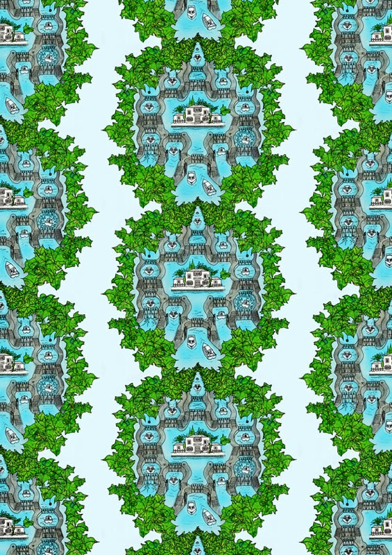
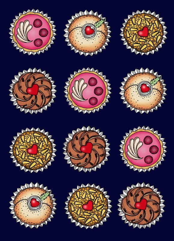
research. I’m especially keen to find a commercial outlet for my patterns.

I have been commissioned to design the book covers for a series of five novels to be published by a writer friend in the summer.

If all goes according to plan I will have an exhibition in a bar in Cadiz during the carnival this year. This is one of the busiest times in the Cadiz calendar, with people coming from all over the world, so it’s a good opportunity for exposure and hopefully sales.

At this point I think it unlikely that I'll go on to complete a degree; in a purely practical sense at the rate I've worked through this level 1 course I wouldn't finish within the 12 year deadline. I plan to take a few months break from studying to concentrate on some personal projects which I've sidelined (e.g. portraits, screen printing patterns on to walls, reorganising my website, promotion) and to complete the book cover commission. After that, who knows? I am tempted by the level 1 drawing and book design courses and by the level 2 and 3 illustration courses on the visual communications degree pathway, although I am loath to commit myself to undertaking those parts of the courses which will inevitably seem less relevant and interesting to me. 

Assignment 5: 7 Days

Some initial ideas:


Monday’s child is fair of face,
Tuesday’s child is full of grace,
Wednesday’s child is full of woe,
Thursday’s child has far to go,
Friday’s child is loving and giving,
Saturday’s child works hard for a living,
And the child that is born on the Sabbath day
Is bonny and blithe, and good and gay.


So far illustrating for children and characterisation have not proved to be my strong points and I don’t enjoy them very much so for my final assignment I have decided to make the most of a fairly open brief and concentrate on my strengths and the processes that I do enjoy which are:
Elegant, objective line drawings
Digital manipulation
Collage
Making patterns

Last summer’s boating holiday on the Canal du Midi in the south of France could be divided into 7 day chunks; I took many photos for research and made a few sketches at the time


Instead of recording the trip as a strip I have decided to draw a motif of one aspect of the trip for each of the 7 days and to then make a pattern from it.

Moodboard, thumbnails and patterns


Title page
This is to serve as an introduction to my series of patterns, showing the location of the inspiration.


Fonts
·         7 Days : Eccentric Std, Art Nouveau style, very French
·         A journey...I settled on Blackoak Std in lower case as it has a retro 70’s feel which I like very much
The combination of these two together is reminiscent of a 70’s French cookery book 

I printed the words, traced them in pencil, scanned them to Photoshop and cut, cleaned and inverted/ coloured them
Fonts traced in pencil and scanned
  • Kathryn Hockey: I chose Shruti, very clean and clear in contrast to the fancy fonts of the other text
Maps and background

I adapted the map of Europe I made for the travel guide cover exercise by highlighting France with a flag.


I used my adapted Europe map as a background, stretching it out and adding and subtracting the outlines of my motifs as I made them; trying out different positions and inverting them as well as playing with fonts


Marking the Canal du Midi 

I printed a map of France from the internet 
collaged it using torn pieces from a road atlas of France
scribbled over it with water soluble crayons and applied an acrylic wash
when that was dry I applied a crackle glaze and rubbed a mixture of bees wax and white acrylic paint over the cracks to highlight them
I embroidered a running stitch to mark the Canal, with French knots to mark the towns of Toulouse, Carcasonne and Sete, with another for Paris in the north

I don’t find it that appealing visually, so I will have to think of a different way to mark the canal but I do like the effect of changing the tone and saturation


I used this map I found on the internet as a guide, first tracing the line of the canal on a new layer in Coral Painter with my tablet 


and then using it to mark the canal in the right place on my collaged map of France in Photoshop where I also added the place names in Blackoak Std, the same font as the ‘a journey in patterns’ text for continuity.


I experimented with different types of border and layer effects for the canal line on the Canal du Midi map, and also played with the position of the background map


I eventually labelled the Canal du Midi with Courier New font, to resemble an old fashioned type face. I made the background darker to improve the contrast.


I added one of the boats from the lock drawing (see below) in a new layer, coloured it and added a granular texture in Photoshop and Corel Painter. Then I placed a smaller copy of the canal map with reduced opacity over the larger map of France to complete the orientating diagram.


 The France arrow is cut from one of my adapted maps which I collaged with labels before applying a crackle finish and white glaze

I liked the strength of the orange Canal du Midi map but felt that it was slightly over powering so I adjusted the tone and saturation


before settling on this version


7 Motifs for 7 Days
All the motifs were made in a similar way: photos / sketches on site; preliminary sketches from my photos; pencil / pen drawing; scanning to photoshop; cutting out line work; cleaning; colouring with collage or flat digital colours; adding texture in photoshop and / or painter; repeating the image to make patterns; adjusting the colour/texture of the backgrounds.

Dragonfly

My photo

Drawing

Scanned, duplicated and flipped
Playing with tones and saturation

Playing with tones and saturation on inverted version

Inverted and multiplied

These are my favourites
With an aged paper background

Multiplied


Locks


3 of many photos


Sketches made on the spot

Postcard showing the lock mechanism

Lock mechanism diagram found on the internet

To work out how to portray the lock mechanism in a 3D way I made a series of sketches showing the various stages


Final sketch
The one which emerged at the end of this process had a fairy tale quality which I liked very much, so I tried out making a pattern from it


I traced my sketch and made a pen drawing which I scanned in two parts


Sections of the drawing duplicated, cleaned, aligned in Photoshop

Patterns
The outlines were cut out and applied to a scan of handmade paper in Photoshop layers, I adjusted curves, levels and saturation/tint. 


In this pink version the colours reminded me of the fading flowers of a bougainvillea, I applied stripes with the pencil tool in pink and green to accentuate the vertical, reducing the opacity of the layers so as not to lose the surface texture of the paper.


Obviously the fine detail of the repeated unit cannot be seen from a distance, but I like the idea of a hidden message that is revealed the closer you get or the longer you look.
I think the lines could have been softer and more attractive if I had left them in pencil.

I felt that the drawing lacked definition so I coloured it in Photoshop layers, using my France map collage for the leaves, a scan of and this photo for the stone parts and gates of the lock system


and a soft edged brush tool for the water


Collaged drawing
I then repeated the pattern on different backgrounds 


Scanned blue paper background

Scanned blue paper introduced as stripes

Blue paper stripes cropped into circles on a flat cream background 
Finally I added another layer of the drawing outline on top and reduced the overall opacity of the blue stripe background, erasing it completely under the boats to improve the definition even more.


The form of the repeated unit is reminiscent of Tibetan thangka layouts.


Patisserie


My photos


Sketches

Photoshop sketch

Drawings

Photoshop proper, showing inverted outlines and coloured versions


Patterns

Addition of inverted line drawings in the background, textures and curves adjusted to give more depth


Final crop


Plane Trees
Planted between 1681-1810, plane trees line long lengths of the Canal du Midi and are dying because of a fungus. I decided not to portray the dying trees in favour of aesthetic delectation.

At first I thought to draw an entire tree and repeat it but had problems working out how to do it, primarily because of the proportion of the trees


My photos


Sketches from life

Sketches from photos

Then, remembering the beautiful designs of Marthe Armitage I decided to concentrate on a small section of leaves and branch and repeat that.

Natural History Museum photo


Sketches to work out the repeating unit
Photoshop sketches to try out the repeat


Drawing


Photoshop pattern layouts

Patterns and collage
I used a scan of the collaged map of France I made for the cover/ intro page.

I recently got a large display screen to go with my lap top, which is great for photoshop-ing but is very bright in comparison meaning that some images lack contrast when seen on another screen or printed


Images with  contrast, tone and saturation adjusted


Cropped 

I like this one very much but I think that the pattern is overwhelmed by the background texture; I will try to make the pattern bolder and the background planer to improve the contrast. This outline does work well on the cover though.


 I traced the first drawing and added more veins


Pencil drawing
Scanned, brightness contrast adjusted, layers multiplied and combined
Digital collage with France map collage
Lines inverted

I love these autumnal colours but the leaves need to be summery green for this image
Added layer effects to inverted outline 
Multiplied

Different pattern
Yet another
The two patterns which came out by 'accident' at the end even more effective than my previous layout. Well worth the redo.

2CV
My photo

photo I found through a web search

Sketches

Pen drawing

Coloured in Photoshop

Initial pattern experiment in Photoshop with a scanned paper background for texture

Experiment with saturation in Photoshop
                                           

Cleaner background and tonal experiments in Photoshop

My favourite


Grapevine


My photos


Sketches

Drawing, scanned and cleaned in Photoshop

Monochrome Photoshop pattern sketch

Colouring with collage in Photoshop layers:

Map fragment collage
Marbling with adjusted tone and saturation
Paper
Paper

Single unit 


Pattern

Sunflowers
I looked at Vintage sunflower wallpapers for inspiration


My photos

Thumbnail sketches
I wanted to show the sunflower turning, as if towards the sun


Pencil drawings


Photoshop pattern layout sketches and colour experiments

I chose a sun flower yellow background for the next stage


Line work cut out, cleaned and trimmed in photoshop


Possible patterns


Potential colour combinations

I like these very much but I wanted to add a bit of texture and colour to the flowers so I collaged the centres and green parts with two different tonal versions of my collaged France map and coloured the petals with flat and graduated colour in Photoshop layers

Collage and colour completed

Single unit
Repeated

Multiplied
Different arrangements and backgrounds
Lastly I added light texture to the background by introducing a scanned canvas with the layer mode set to multiply. I think the blue background works best as a contrast to the yellow flowers, it also represents the summer sky.


So just to recap, here is my title page and my 7 patterns

7 Days - a journey in patterns

Day of the 2CV

Day of the Sunflower

Day of the Locks

Day of the Grapevine

Day of the Dragonfly

Day of Patisserie

Day of the Plane Tree


I had lots of fun with this assignment and I am very pleased with the results. I think the French-ness comes across quite well and I can definitely imagine some of the patterns adorning the papered walls of a chateau.

I would like to get the patterns printed as an eight page book, perhaps as a promotional tool, and would love to see them on fabrics, wallpapers, wrapping papers, greetings cards and other surfaces. Wallpaper certainly seems to be fashionable again at the moment and features in many TV programmes and films such as Sherlock, American Hustle and August: Osage County.

It was very helpful to have feedback from a few trusted friends during the exercise when deciding which patterns and colour combinations worked best and which needed further adjustments.