Research
I actually got
told off for taking photos in the first supermarket I chose for research...luckily
the others weren’t as picky.

I also looked online:
Trend Hunter website for packaging ideas

Extinct animals
I had a look at this site and didn’t think that any of the extinct creatures would appeal to children as
much as dinosaurs, except perhaps the dodo.
I immediately decided against including the Coelophysis as
it didn’t appeal to me as much visually.
I chose one dinosaur for each flavour and did some thumbnail
sketches
Sketchbook


I wanted my dinosaurs to be funny, friendly and cartoony so
as to appeal to children.
Colour-wise I chose purple for the raisins, orange for the
ginger and brown for the chocolate chip, deciding to colour the dinosaurs, one
for each flavour, then tending towards their complimentary colours for the background
packaging to hopefully make them stand out in a zingy way.
At first I imagined that I would use flat digital colours,
in fitting with the cartoon drawing style, adding texture by drawing it in. Then
I did some experiments with marbling, improvising with oil paints diluted by
white spirit and mixed in a water bath.
One of my results reminded me of reptilian skin

so I opened it in photoshop and adjusted the colour balance
to change it from blue to purple.

I then took one of my thumbnail sketches, cut out the shape,
copied it to a layer mask over the purple, applied the mask and cut and pasted
the result to a new document and then layered over the cut out line work

This worked pretty well so I put him on a yellow background,
textured with a tissue paper layer,

then copied the dinosaur shape, pasted it to a layer mask
and then lightened his belly and chest with a 246 point brush in white with
soft edges.
I also made a strip with multiple images which could be used
elsewhere on the packet.

Deciding on the shape of the package
Initially I thought of making the image to fit a tube, but
looking at various tube shaped packaging I realised that only half the area is devoted to the image,
the rest being reserved for information and this didn’t fit with my idea of
including two dinosaurs in the image; one in the foreground observing the other
at play with the biscuits in the background, so I opted for a rectangular
shape.
I then used my thumbnail sketches to work on a layout with
the text for each flavour


Choice of fonts
I decided to include the name of the dinosaur on the package,
making a play on words with the flavour name. I chose Prestige Elite Std, an old fashioned typeface style font for the name of the dinosaur, such
as you’d find labeling an exhibit in an old museum and Curlz MT, a fun, informal font for the name of the flavour.
I curved this text to make it more lively.
I planned to replace the O in organic with a drawn biscuit image
eventually so I chose the perfectly
circular O of Century Gothic followed by
distorted segoe script for the rest of
the word. I’m not sure this works yet, so I’ll return to it later.


I added purple shading to the dinos, changed the background colour, moved
the ‘Organic’ and altered the biscuits (they still need detail)

I used different pieces from my marbling experiments to colour the
other dinosaurs, first changing the colours in photoshop to match the flavours


Another batch of biscuits (with raisins this time), another box, another mock-up

Line visuals
I printed the thumbnail layouts and traced them in pencil,
making a few adjustments to the position and posture of the dinosaurs, then
scanned them to photoshop multiplying the layers to make the lines more bold.


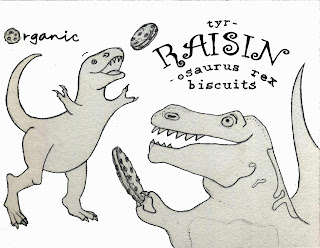
Colour line visuals
I coloured the T-Rex version with the colour adjusted
marbling in photoshop as detailed above.
I opted to replace the traced Prestige
Elite Std text with computer generated text as it looked too uneven, but decided to keep the 'organic' and flavour title hand drawn.

I found the result a bit disappointing at this stage; I think this is because
- the background dinosaur is too big
- the dinosaur shapes lack depth, they need shading
- the biscuits need more work
- the background colour is not quite right
This is a version with the background dinosaur made smaller, he
now fits into the space better but the ‘Organic’ and the biscuit he is stretching for are in the wrong place


 |
| Chocolate chip |
 |
| Ginger |
I saw a programme about Wallpaper recently where they
discussed the 'deepening' effect of adding layers of subtly coloured patterns between the
foreground and the background so I thought I’d try it here


I used a photo of ferns (since ferns are prehistoric) that I found on the internet, I’m
not sure if that breaches copyright since the original image is unrecognisable.
I asked my tutor for advice, she said “I don't think it
does, it's all abit of a grey area to be honest. If you credit the source you
can be sure that you're not trying to hide anything.”
I chose a bright green background colour for all the boxes
because it is eye catching, it sets off all the flavour colours well and
unifies the set.
Although the Triceratops also work well with blue

The T Rex is my favourite so I developed it to the mock up stage, here are the sides and front


Mock up


On reflection
The colour LV’s are probably a bit over developed for this
stage, considering the likelihood of changes being required in a real life
situation but I wanted to experiment with layer masks in photoshop so it was
worth the extra time.
The marbling worked really well as textures for the
dinosaurs and biscuits.
Overall I’m pleased with the results, I think they are eye
catching and would appeal to adults and children.
However, the little
stegosaurus and triceratops are a bit stiff looking, next time I’d make them
more fluid like the t rex.
A few days later I made some biscuits to take to a friend’s
party, they didn’t have raisins in them and they weren’t organic so I changed
the text slightly (the colour coding doesn’t match, but never mind) and made an actual 3D mock up with a different box.


Another batch of biscuits (with raisins this time), another box, another mock-up

No comments:
Post a Comment