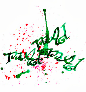
Having experimented with writing the words in the exercise freehand,
I made a crib sheet in photoshop, roughly dividing the fonts by styles. I’ve printed it out and can refer to it easily rather than scrolling through the font list where the samples are often too small to see clearly.
The fonts I chose for each word:
Big: Rockwell extra bold, serif, distorted to appear taller
Small: Tekton Pro sans serif, lower case
Fat: Blackoak
Std bulgingly
distorted in a fat, fleshy tone is my favourite as it is so chunky, stencil std also works well
Thin: Eras
Light ITC I adjusted the kerning to make letters closer
and used free transform to make it taller and thinner
Fast: Freestyle Script with
an upward slant to represent speed
Slow: Edwardian Script, to depict elaborate care in the
rendering of the word
Fun: loopy
Giddyup and circus-y rosewood curved and coloured brightly
Boring: Myriad
Pro, sans serif in
black
Calm:
smooth, even Brush script Std
in a gentle colour
I then
traced the printed words and coloured them using various materials:
 |
| Watercolour paint and a chalk background |
 |
| Water-based crayons |
 |
| Italic dip pen and ink |
 |
| Indian ink, fine nib dip pen, crackle glaze and stain |
 |
| Gold pen on black paper |
I have
also collected a few interesting fonts from:
TV
Programme credits
‘Wodehouse
in Exile’
·
set
in 1940s
·
like
an old fashioned type writer
·
Miriam
Fixed (for
some reason I can’t access the actual font in word)
·
Simplified
Arabic Fixed
(for some reason I can’t access the actual font in word)
‘The Lady Vanishes’
·
TV
version 2013
·
Set
in 1930s
·
fine,
elegant, sans serif, all higher case
·
MS GOTHIC
·
Eccentric Standard
Local
restaurants
Quatro Gatos nice mix of fonts on this website, I like the g in gatos
The Basque Country
I’d never seen this traditional Basque font or Euskara
typeface before my recent visit. It is characterised by thick serifs and
derives from stone and wood carving styles http://en.wikipedia.org/wiki/Basque_language
I love the way that Andrea Joseph includes many
different styles of hand rendered text with her drawings, distorting them
beautifully at times
This illustration
which I found on the BBC Radio 4 website (with no credit of the artist) is
delightful in its incorporation of text (albeit abstract) and image.
I love the complexity and depth of this illustration by Kristjana S Williams for Triumph
lingerie, her delicate mix of text, collaged drawings and digital work is
really inspiring.
You can see a short interview with her discussing the
project here.
I find the artwork of my dear friend Arti Kraaijeveld
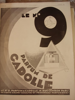
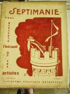
Other signs, posters and flyers with interesting use of text and
image
 |
| Interesting mix of fonts on this hand painted sign for a local restaurant |
 Local bar flyer, clever mix of colour, texture and text |
 |
| Classic 70's style text |
I really enjoyed this exercise, especially the tracing and colouring of printed text and I will certainly incorporate the technique into future work.


No comments:
Post a Comment