Sunday, September 29, 2013

Wallpaper

I caught the end of a TV programme (Fabric of Britain) about wallpaper the other day, featuring gorgeous designs by


This picture of one of Marthe’s inked lino cuts is outstandingly beautiful 
According to the online ‘Bible of British Taste’ she makes the best wallpaper in the world 

and of course


I find these particularly compelling because my own style tends to be very flat and I have a fondness for repeating an idealised version of a thing, creating symmetry where there is none.
A chap interviewed in the programme said that the addition of layers of subtle colour adds depth to an otherwise flat design. I’d like to give that a try.

The Fabric of Britain is part of the homely and inspiring Handmade in Britain season with its lovely logo 

Monday, September 23, 2013

Review: Summer Exhibitions

Couples
August 2013 Ventenac, France

This exhibition consisted of six short films showing simultaneously in a beautiful old, empty wine cellar. The nature of ‘romantic’ relationships was the central theme to all the films.


It so happened that on the day I went, with my reluctant boyfriend, relations between he and I were pretty strained, so much so that the pertinence of the violence in Marina Abramović and Ulay’s films made me laugh in recognition, especially the slapping sequence; ‘Slap! Wince. Slap! Wince....two people locked in a repetitive pattern of spite and retaliation. In the bow and arrow sequence the gradually building strain in Abramović’s whole body is evident as she keeps the bow wielding the arrow which is pointed at her heart taut. Ironically without her pull on the bow the arrow would have no force behind it. I should point out here that my boyfriend and I have never slapped each other and are happily over our blip. He didn’t find any of the films remotely amusing.


Marina Abramović’s performance piece ‘The Artist is Present’ is cited by Kelly Grovier in this Sunday Times Culture supplement article   as being one of a ‘hundred contemporary art masterpieces which will still be remembered and discussed centuries from now’. I defy anyone to watch without emotion this clip in which she and Ulay are reunited after 30 years without contact; it makes me cry every time.

Clap
August 2013 Paraza, France 


The two artists in residence, Sofu and Rémi Magnouat, had a month to create two exhibitions called ‘Over the Trees’ addressing the theme of the dying Plane trees which line the Canal du Midi, on the bank of which the gallery sits.

I loved Sofu’s ceramic installations made up of small components chained together which are a metaphor for the connected parts of a whole, be it an individual life, the lives of many or a territory.


This ‘united division’ is also illustrated in this installation of hanging coloured strands which look like a tree trunk.


Upstairs there was a room full of small sculptures of the human form in various poses and groups which inspired in me a feeling of good humoured fascination probably becuase of their small size and appearance of patient observion, like little white human meerkats.


It was also very interesting  and inspiring to see the work displayed withing the studio space, to see the materials lying about, the trials and ‘workings out’.


I wasn’t so keen on these painted aluminium characters ‘in the flesh’; they seemed brash and rough after the serenity of the ceramic pieces, but seeing them later in my photographs I enjoyed them more.


Shop window paintings
August 2013 Carcassonne, France


I was a bit divided by these works of street art by Mohamed Lekleti  that I saw painted on shop windows in Carcassonne; when I saw the first one my interest was piqued but on closer inspection I thought it missed the mark slightly in terms of colour and proportion, however my admiration grew as I saw more and more, probably because the style was consistent (something I think my work lacks), the ground was ingenious and the amount of work involved in the project must have been huge. I was also envious; I’d love the opportunity and audacity to do something like this.

Museum of Art and History
August 2013 Narbonne, France
The number of art works in here was huge, they seemed a bit jumbled and some were poorly lit but it was very enjoyable. Here are a few of my favourites:


Winter Garden by Stephen Marsden, is an installation of six 17th century style busts with their heads replaced by roses, lit with different coloured lights and standing on a lawn of herbs. These looked like giant chess pieces and it was shame not to be able to see them from closer quarters as they appeared to lack emotion from a distance, I also felt that it was really just one piece multiplied as the only difference between them was the colour of the light directed upon them.

The detail in these 17th century paintings was astounding:
Portrait of a Woman by Elias Pickenoy


Portrait of a Woman by Jan Anthonisz van Ravesteyn


And this 15th century religious painting by Neri di Bicci looks remarkably modern


 The sheen on the dress in this unlabeled painting is mesmerizing


And this 18th century portrait of a beggar by Gaspare Traversi is a marvel of suffering and perspective


You can feel the dry heat in Max Moreau’s 1936 oil painting of a water seller


Exercise: Text and Image

Having experimented with writing the words in the exercise freehand, 


I made a crib sheet in photoshop, roughly dividing the fonts by styles. I’ve printed it out and can refer to it easily rather than scrolling through the font list where the samples are often too small to see clearly. 


The fonts I chose for each word:

Big: Rockwell extra bold, serif, distorted to appear taller
Small: Tekton Pro sans serif, lower case
Fat: Blackoak Std bulgingly distorted in a fat, fleshy tone is my favourite as it is so chunky,  stencil std also works well
Thin: Eras Light ITC  I adjusted the kerning to make letters closer and used free transform to make it taller and thinner
Fast: Freestyle Script with an upward slant to represent speed
Slow: Edwardian Script, to depict elaborate care in the rendering of the word
Fun: loopy Giddyup and circus-y rosewood curved and coloured brightly
Boring: Myriad Pro, sans serif in black
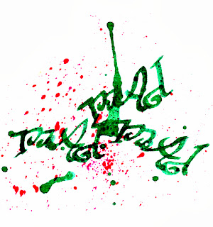
Mad: Jokerman, Curlz MT, upper/lower case and different font sizes within the word, twisted in free transform and coloured brightly
Calm: smooth, even Brush script Std in a gentle colour


I then traced the printed words and coloured them using various materials:


Those which I think worked best, tweaked a bit in photoshop:

Watercolour paint and a chalk background

Water-based crayons

Italic dip pen and ink

Indian ink, fine nib dip pen, crackle glaze and stain

Gold pen on black paper

I have also collected a few interesting fonts from:
TV Programme credits
‘Wodehouse in Exile’
·         set in 1940s
·         like an old fashioned type writer
·         Miriam Fixed (for some reason I can’t access the actual font in word)
·         Simplified Arabic Fixed (for some reason I can’t access the actual font in word)

 ‘The Lady Vanishes’
·         TV version 2013
·         Set in 1930s
·         fine, elegant, sans serif, all higher case
·         MS GOTHIC
·         Eccentric Standard

Local restaurants
Las Delicias  elegant art nouveau style font, nice kerning
Las Delicias poster


Quatro Gatos  nice mix of fonts on this website, I like the g in gatos

The Basque Country
I’d never seen this traditional Basque font or Euskara typeface before my recent visit. It is characterised by thick serifs and derives from stone and wood carving styles http://en.wikipedia.org/wiki/Basque_language


I love the way that Andrea Joseph includes many different styles of hand rendered text with her drawings, distorting them beautifully at times 


I find the title from this ad for the film Populaire very appealing, unusual and evocative in its form and colour with that dinky little illustration in the O.


Pop-art inspired salad cream ad very eye-catching for its mix of text and image despite its relatively subtle colouring.


This illustration which I found on the BBC Radio 4 website (with no credit of the artist) is delightful in its incorporation of text (albeit abstract) and image.


I love the complexity and depth of this illustration by Kristjana S Williams for Triumph lingerie, her delicate mix of text, collaged drawings and digital work is really inspiring.


You can see a short interview with her discussing the project here

I find the artwork of my dear friend Arti Kraaijeveld  enchanting and other worldly. His combination of found objects with drawings, paintings and text and unusual use of different materials has a timeless and ethereal quality. The repetition of symbols is particularly potent, here are some examples. 

Other signs, posters and flyers with interesting use of text and image

Interesting mix of fonts on this hand painted sign for a local restaurant

Cleverly spaced title incorporating guitar graphic


Vintage feel poster


Local bar flyer, clever mix of colour, texture and text


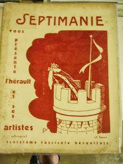
Old books and magazines which caught my eye during a visit to a second hand bookshop in France.

A beautiful big a in brush calligraphy style
                           

I learn to read
                           

Match TV channel logo
                 

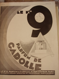
Perfume ad 1929
                           

Magazine from the 20's
                           

Icare magazine founded in 1957 by the French airline pilots' union

Classic 70's style text
                           

I really enjoyed this exercise, especially the tracing and colouring of printed text and I will certainly incorporate the technique into future work.